This case is being updated – more materials are on the way
From a course library to an educational marketplace and social ecosystem for creators
A comprehensive redesign of the Infourok brand and digital platform
About the project
I took part in transforming the product at the level of brand, UX and UI – from shaping the new visual concept to designing key user scenarios, user accounts and the foundation of the design system
The product at scale
Infourok is the largest Russian online educational platform, bringing together learners, teachers, educational content creators and experts
Public platform figures for 2024
Context
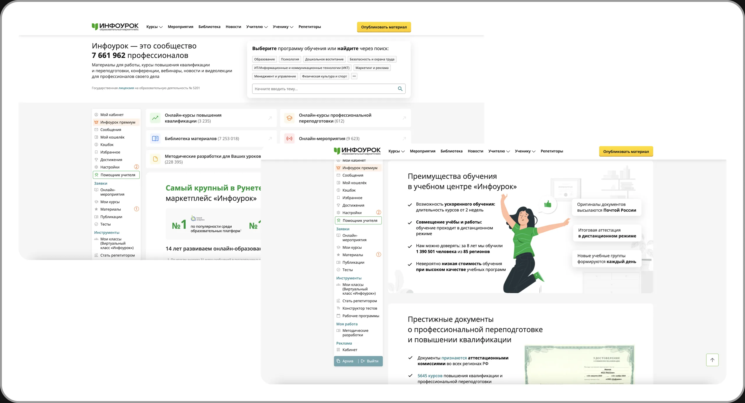
At the time of the project, Infourok was already one of the largest players in the Russian education market. But its model was changing: the product had to grow from a library of educational content into a marketplace and a social ecosystem for creators and learners
The client came to aic for a comprehensive refresh of its brand and digital products. The visual update was only part of the task
Business model
- Commission on sales of materials and courses
- Paid content promotion by creators
- Infourok's own courses
- Advertising
Business challenge
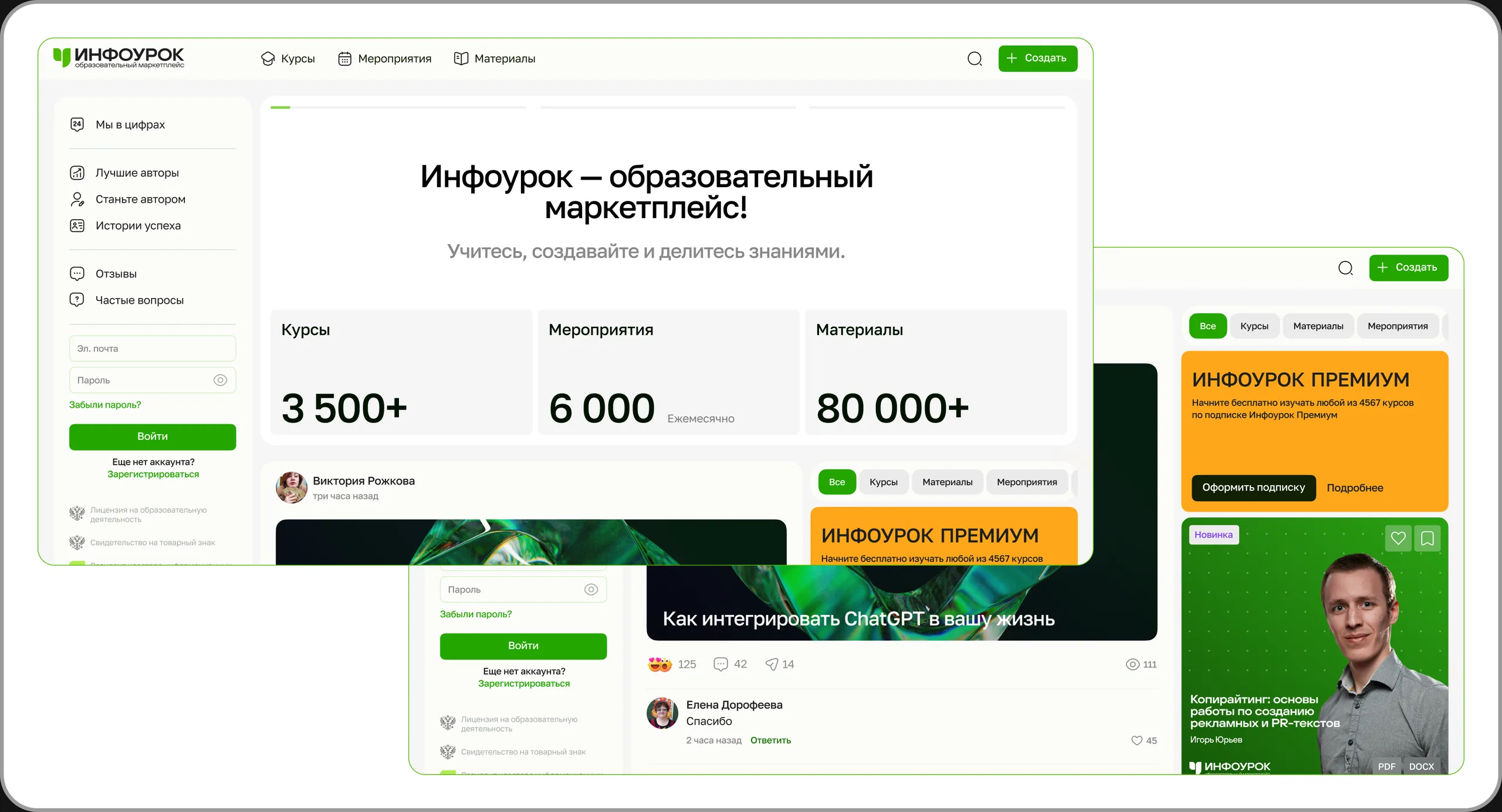
The product had grown, but its interface and visual language no longer matched its scale and new strategy. The platform had to do more than help people consume content: it had to create conditions in which creators come to publish and sell educational products, while the platform earns a commission
| Before | After |
|---|---|
| A library of materials and a course catalog | An educational content marketplace |
| A simple registration form | Personalized onboarding |
| Limited user accounts | A full creator / seller experience and a learning dashboard |
| An outdated visual language | A new brand, architecture, UX and UI |
Goals and metrics
I don't have final post-launch figures: I left the project before the measurements were completed. So below are the goals and metrics the product was aiming for, not results
| Business goal | Target product metrics |
|---|---|
| More course and material sales | Course purchase conversion, Revenue / GMV |
| More active creators | New creator registrations, Creator activation |
| More engagement and return visits | Content engagement, DAU / retention |
| More completed learning | Course completion rate, Learning activity |
Audience and ecosystem
Learners / consumers
Teachers, school students, parents, tutors, curriculum specialists, psychologists, university lecturers, college students and other consumers of educational content. Journey: discovery → evaluation → purchase → learning → completion
Creators / sellers
Teachers, curriculum specialists, tutors, psychologists, university lecturers and other experts who create, publish and sell educational content. Journey: create → publish → promote → analyze → earn
My role and team
I was a Senior Product Designer on aic's external design team. Together with the art director and the brand designer, I helped shape the visual concept, and once it was approved I was responsible for a large part of the product design and led the work of two middle designers
Area of responsibility
- Digital product concept and key pages
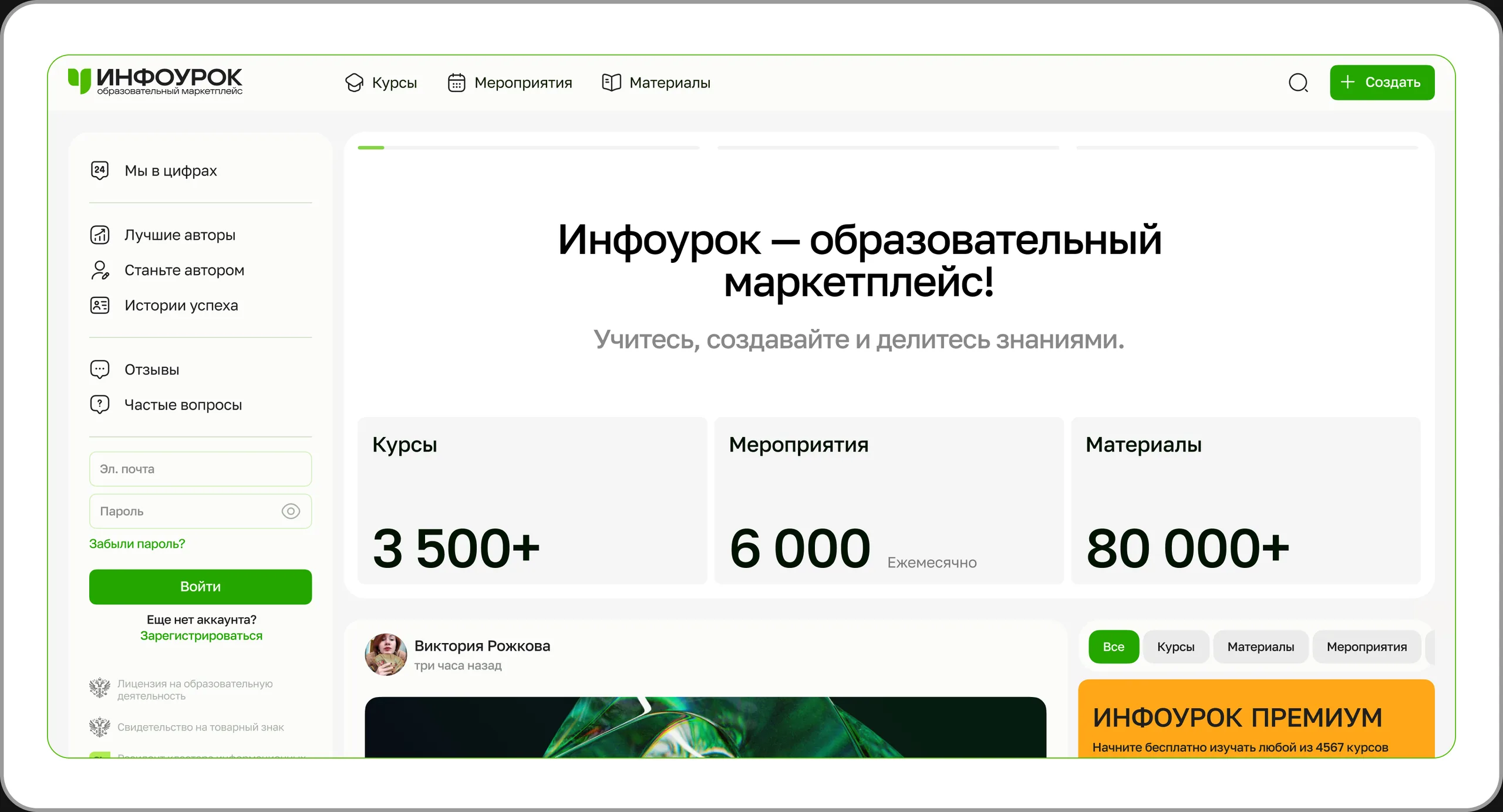
- Information architecture, navigation, homepage
- CJM, user flows, prototypes and UI
- Onboarding, registration and personalization
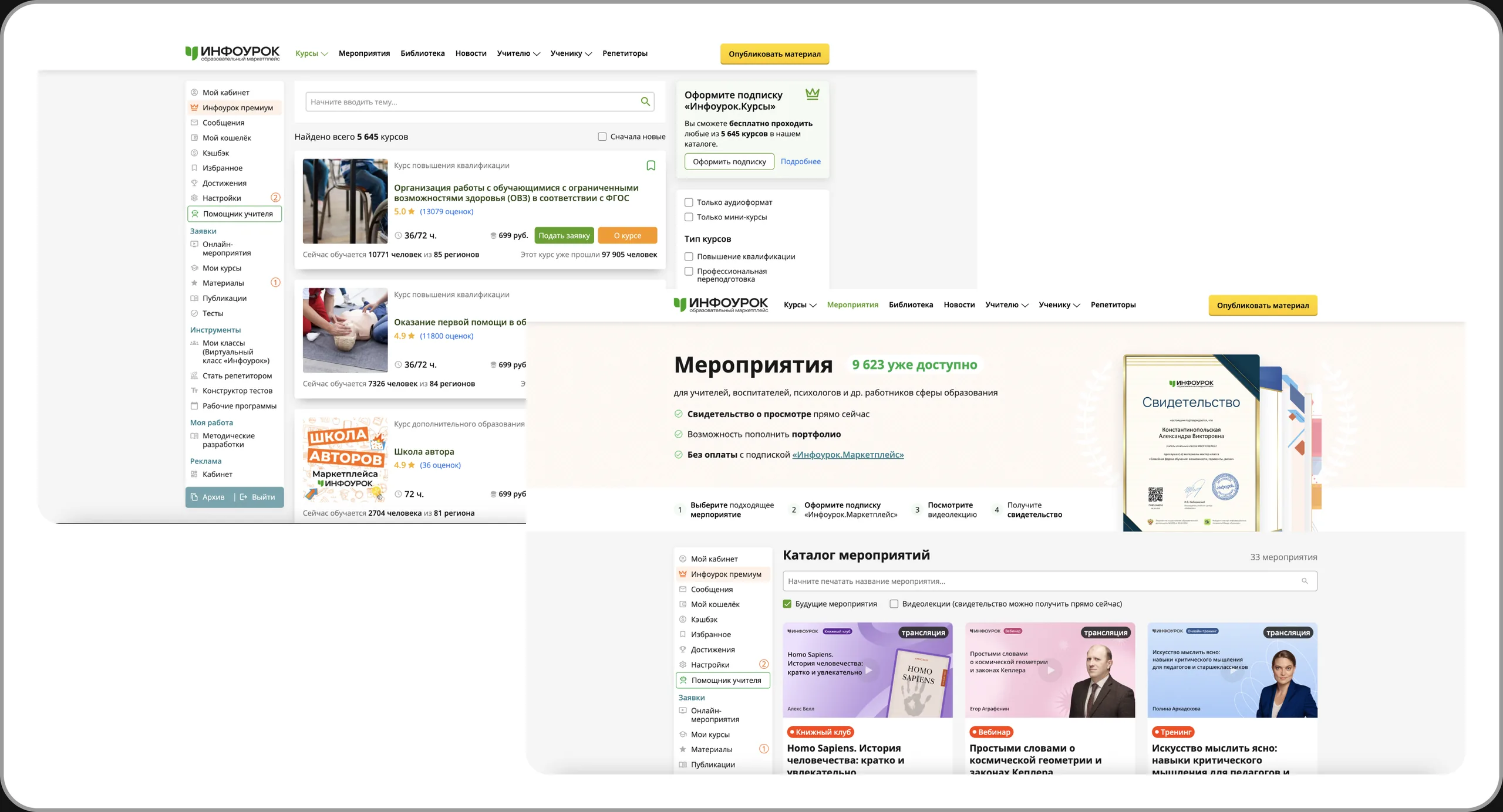
- Course, event and material catalogs
- Course master page and the in-account application
- Course and material pages, marketplace scenarios
- UI Kit, components, states and tokens
- Task breakdown and reviews for two middle designers
- Presenting and defending decisions to the client's team and leadership
- Working with frontend / backend leads and handoff
Team
| aic | Infourok |
|---|---|
| Senior Product Designer / Lead (me) 2 Middle Designers Art Director Brand Designer | 2 Product Owners (web / mobile) UX Researcher Analyst Project Lead / CEO Frontend and Backend leads |
Research and insights
Most of the discovery was run by Infourok's product team: interviews, surveys, Yandex Metrica analysis, user typologies, feedback collection and reviews with educational content experts.
I wasn't the lead researcher. My work started with interpreting the findings and turning them into UX decisions: IA, CJM, user flows, prototypes and UI.
| Insight | What it meant for the product |
|---|---|
| The product knows almost nothing about the user | Personalization should start as early as onboarding |
| A huge amount of diverse content | Clear information architecture and discovery are needed |
| A creator is not just a user | A dedicated creator / seller experience is needed |
| Learning is a process, not a purchase | The dashboard should show progress and the next step |
Competitive analysis
The product was becoming a marketplace and a social platform, so we looked beyond direct competitors and searched for product patterns rather than visual references.
| Product category | What we studied | What we looked for |
|---|---|---|
| EdTech | Coursera, Udemy, Stepik, Skillbox, Netology | Discovery, catalog, course pages, learning |
| Social | LinkedIn, VK, Facebook, Reddit | Feed, community, content discovery |
| Creator platforms | YouTube Creator Studio, GetCourse | Publishing, creator analytics |
| Marketplace | E-commerce seller dashboards and product feeds | Product management, analytics, promotion |
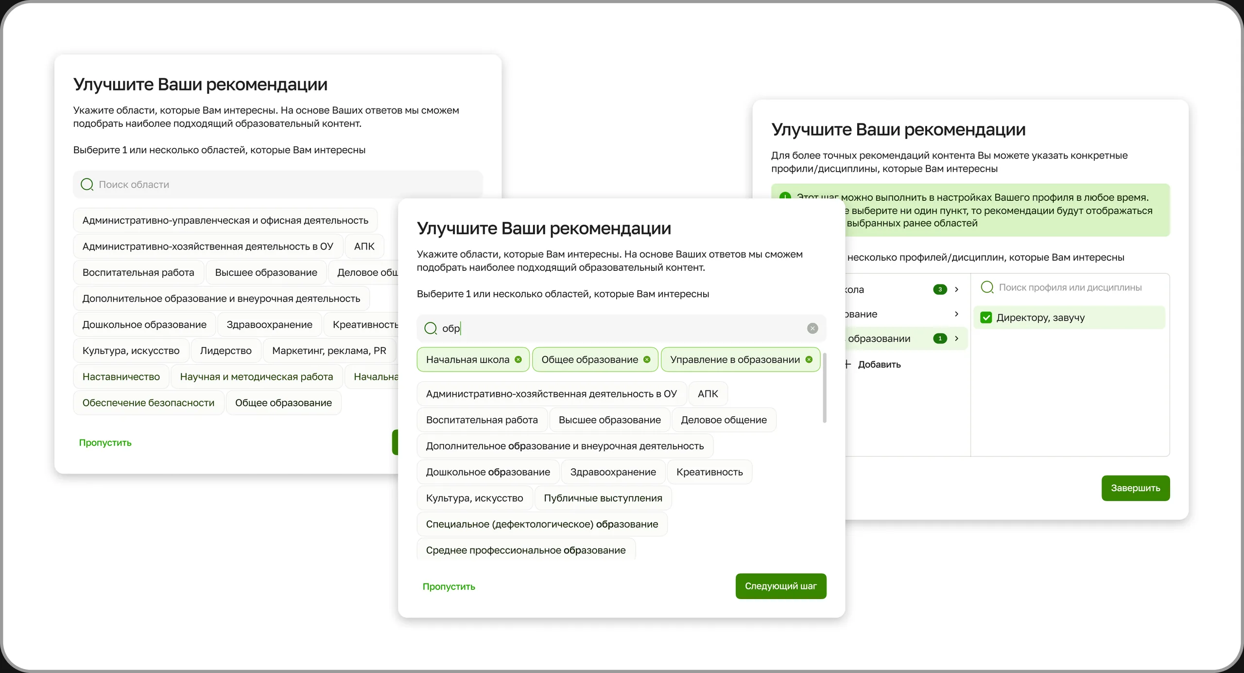
#1. Onboarding and personalization
From simple registration to a personalized learning experience.
AS IS
A standard registration form with personal details. Users created an account, but the product knew almost nothing about their educational context and couldn't immediately offer relevant content.
TO BE
Registration + personalization: role, field, subjects and interests, specialists of interest, learning goal and expected outcome – for example, a certificate.
Flow: registration → role → interests → subjects → specialists → goal → personal feed

#2. Course, event and material catalogs
Three content types – one framework for search and selection.
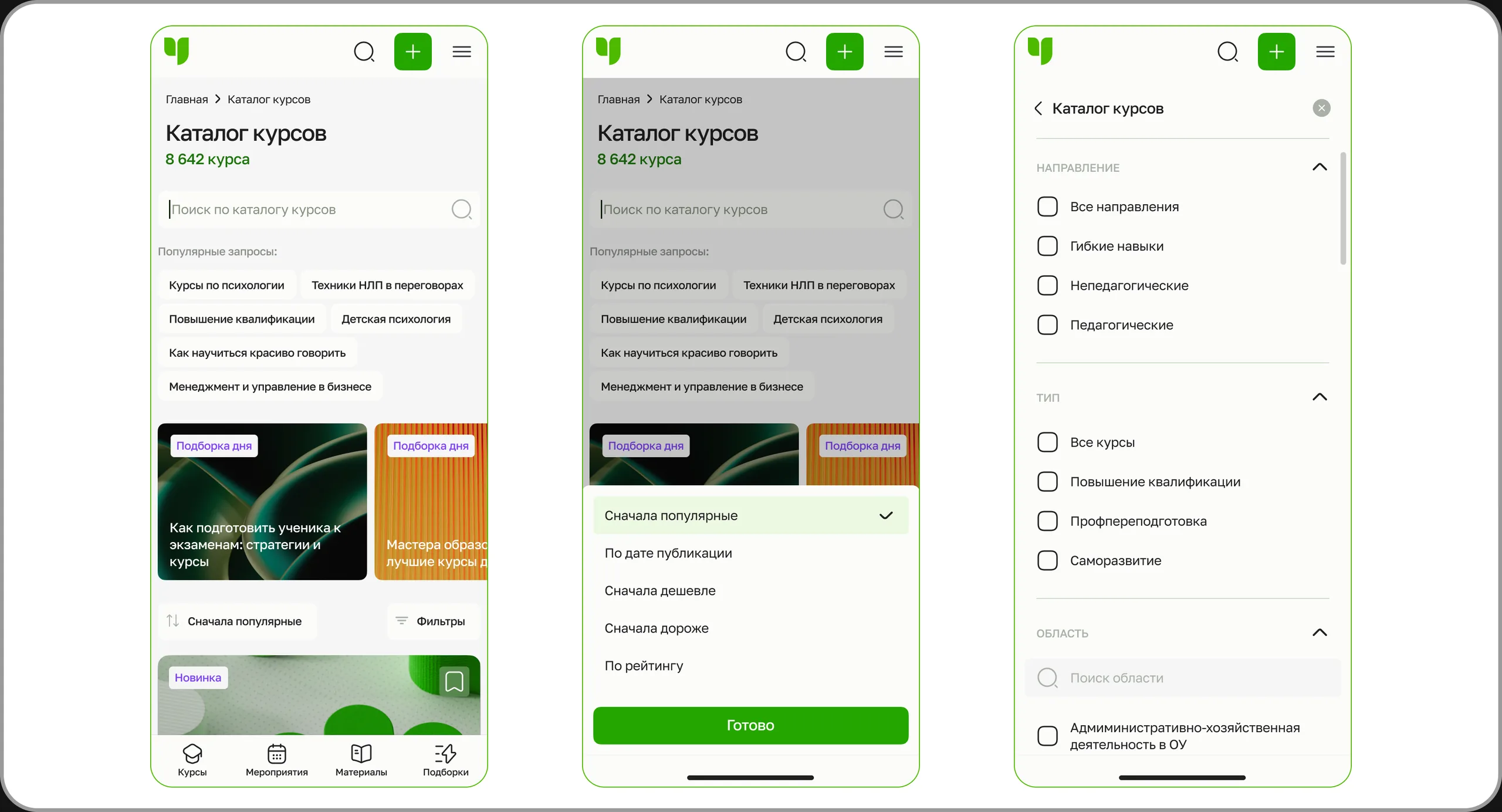
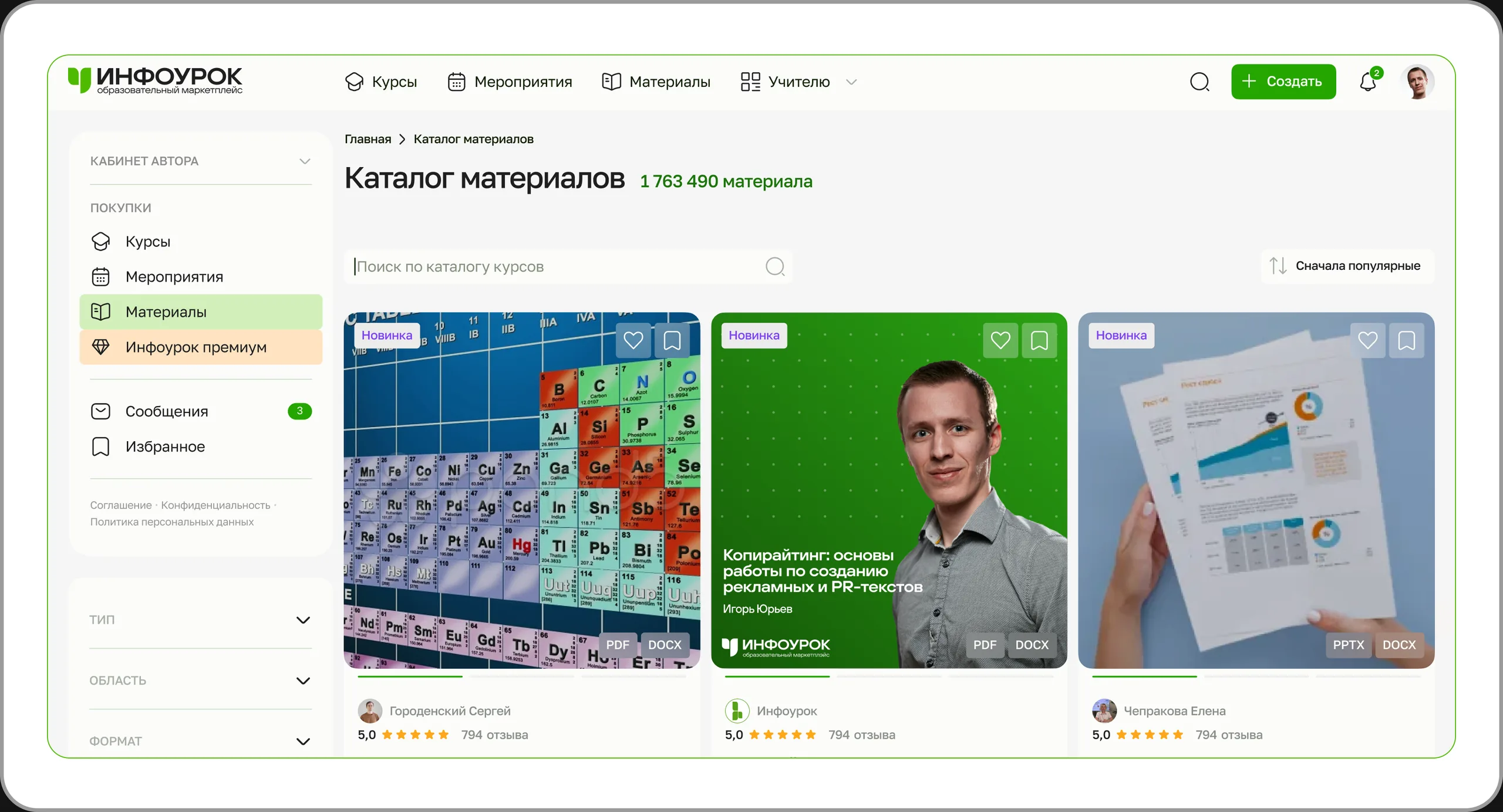
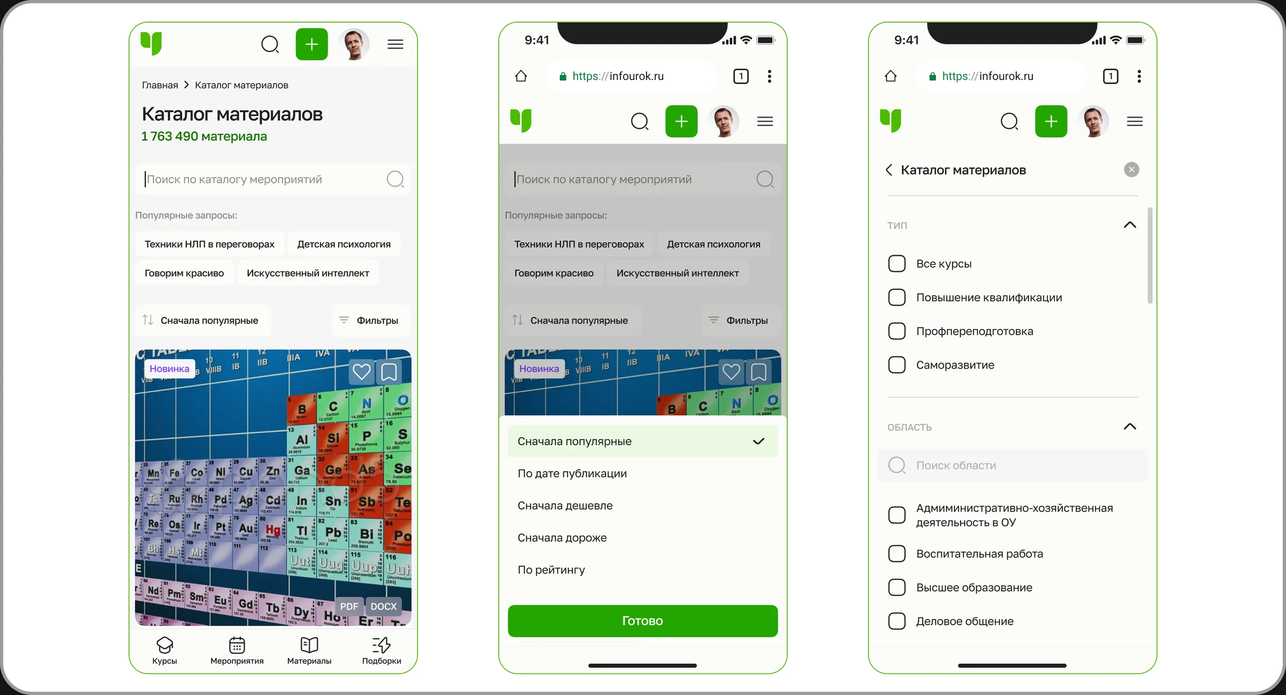
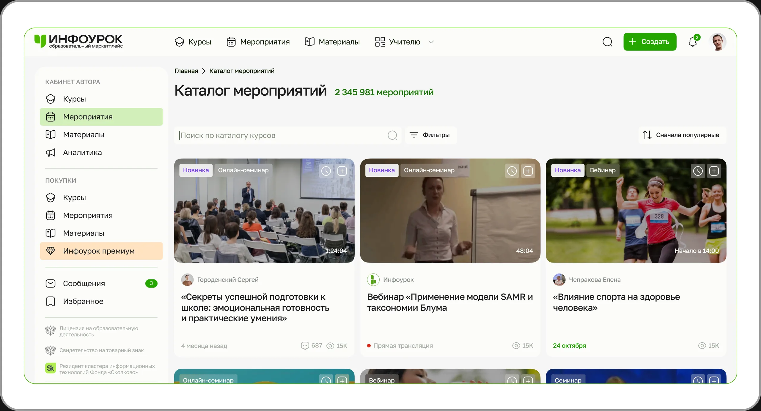
Courses, events and materials had historically lived in separate catalogs, each with its own logic. With millions of content items, users need to narrow down results quickly, and the platform needs to show equally clear cards that are easy to compare and decide on.
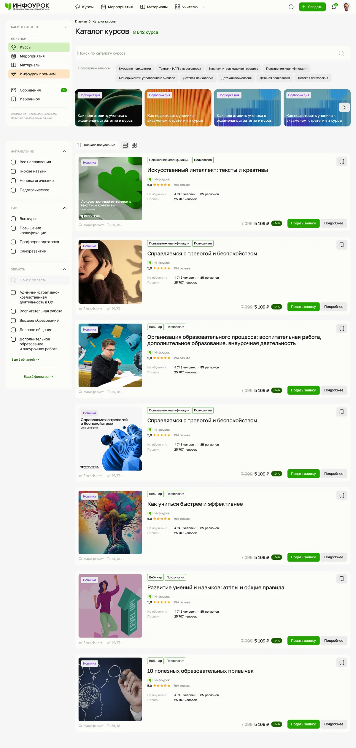
What's shared
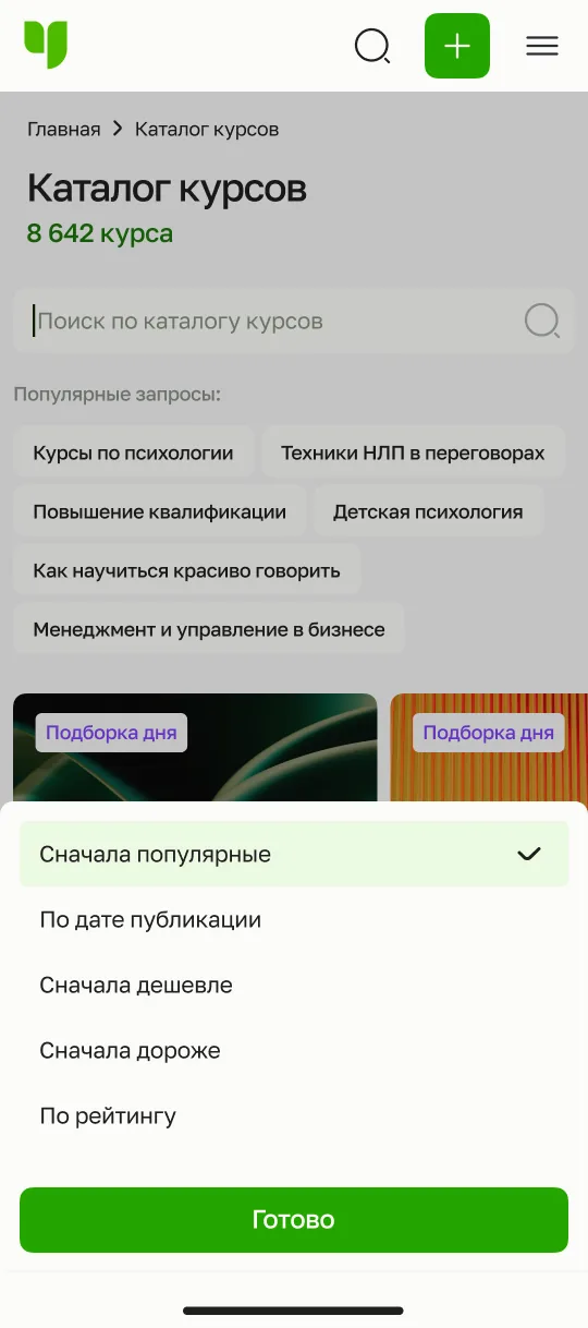
Search and collections
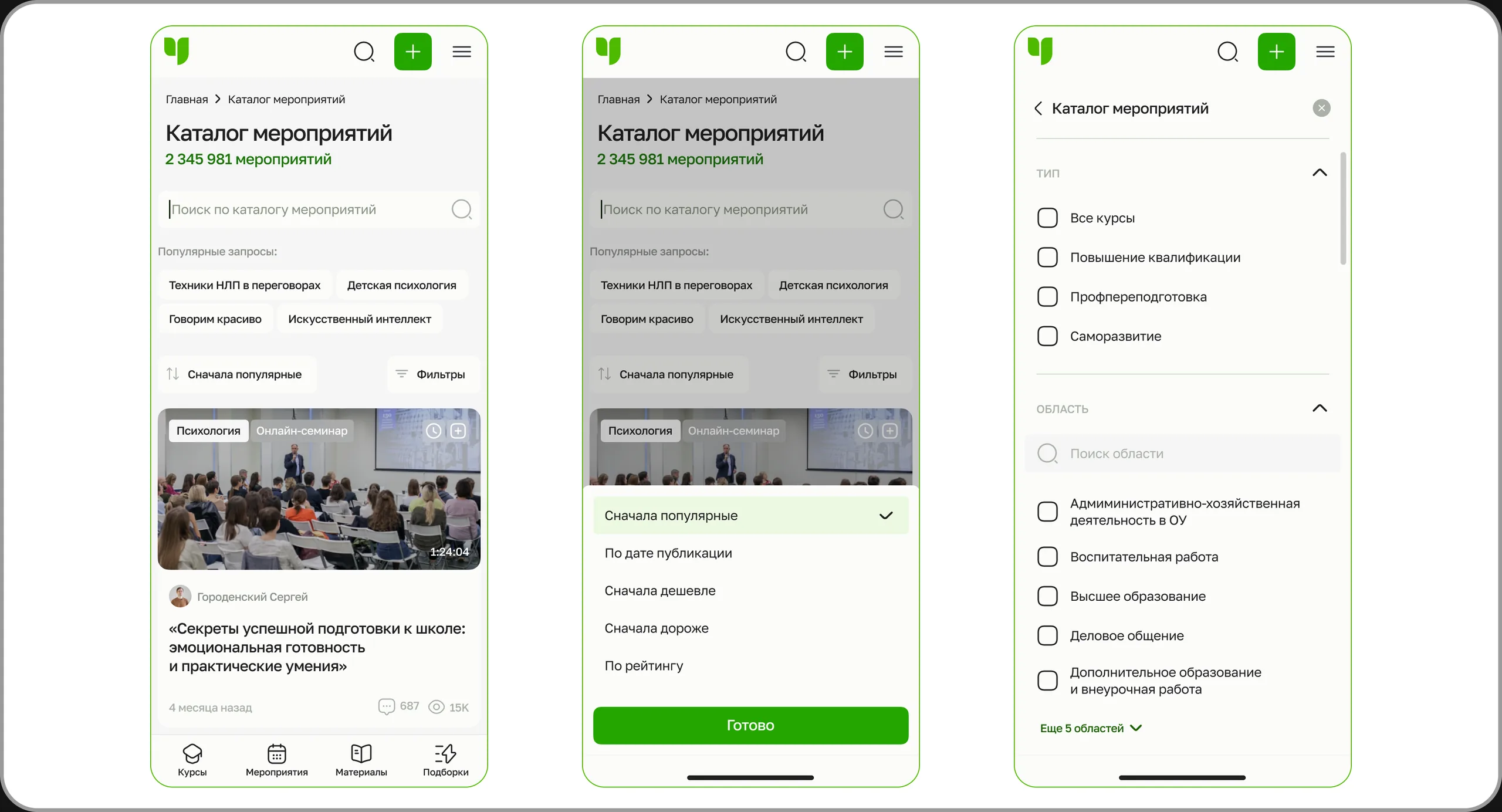
- Catalog search and popular queries
- Themed collections ("Pick of the day")
- Sorting: popular, by date, price low / high, by rating
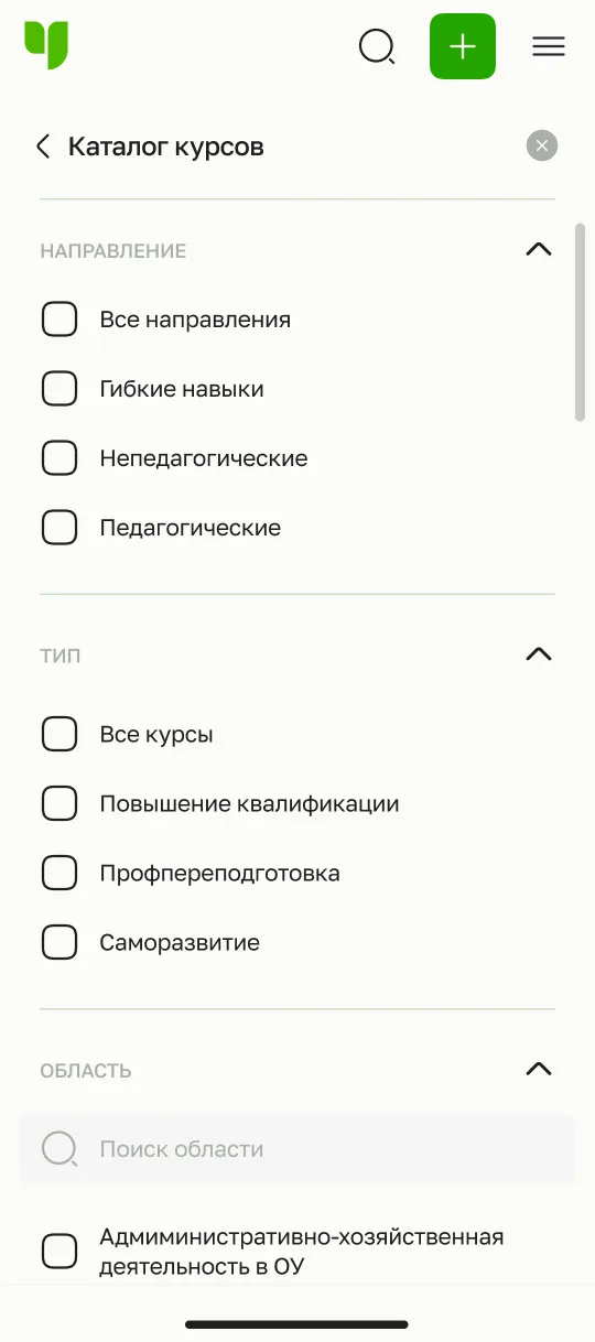
Filters
- Field, type, area, discipline, format
- Search within long lists of areas
- "N more areas / filters" – long lists expand on demand
What changes: a card for each content type
| Catalog | What the card shows | Primary action |
|---|---|---|
| Courses | Program type (professional development / retraining / self-development), hours, rating and reviews, how many are studying and have completed it, price and discount | Apply |
| Events | Format (webinar, seminar, masterclass, club), date or live stream, recording length, author | Watch / join |
| Materials | File format (PDF, DOCX, PPTX), author, rating, views and downloads | Download |
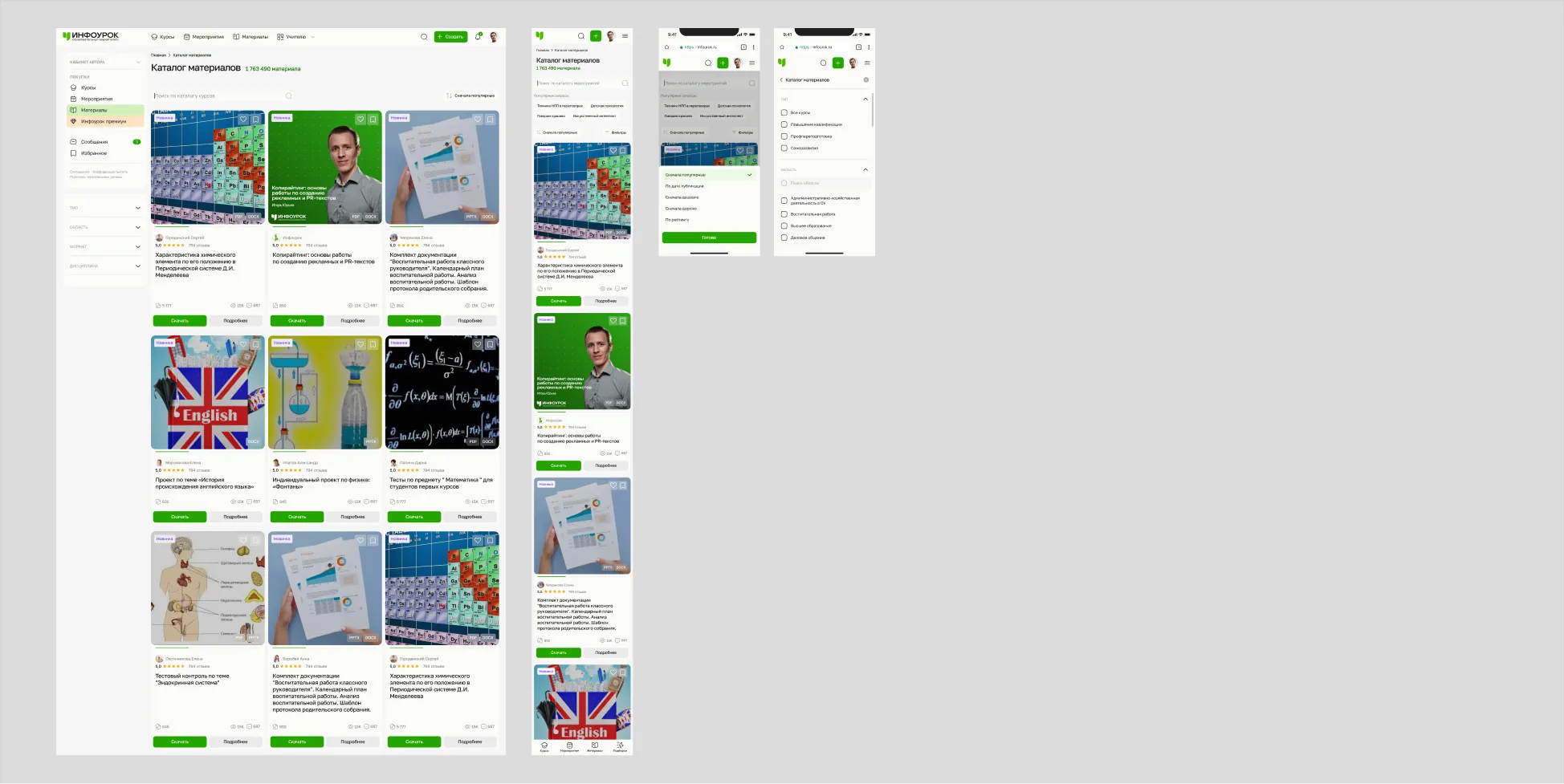
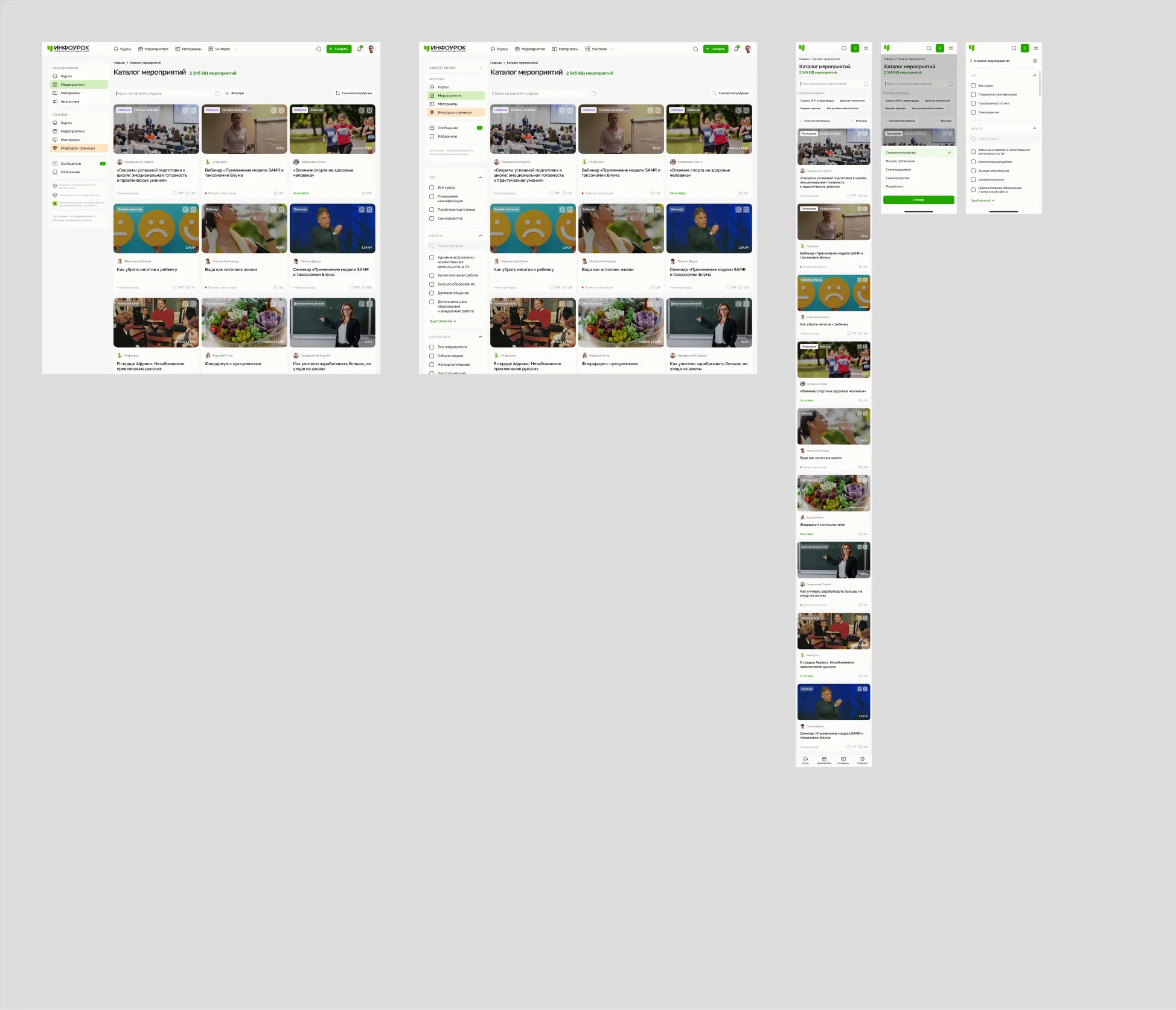
Mobile version
On mobile, filters and sorting move into separate full-screen layers: the results stay clean, and complex filtering doesn't break scrolling.
#3. Course page and master page
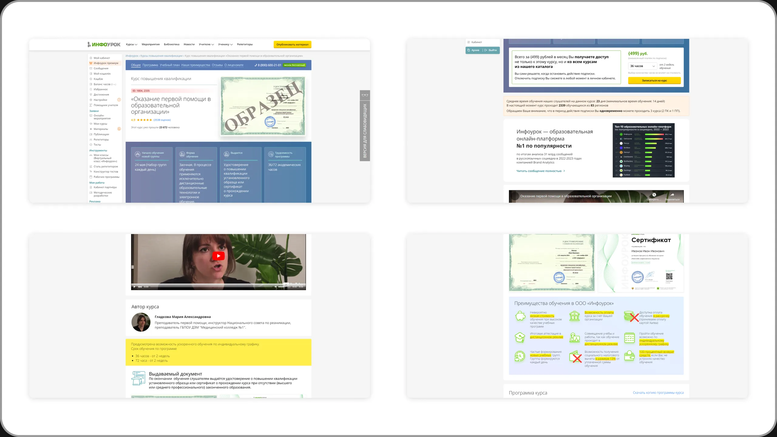
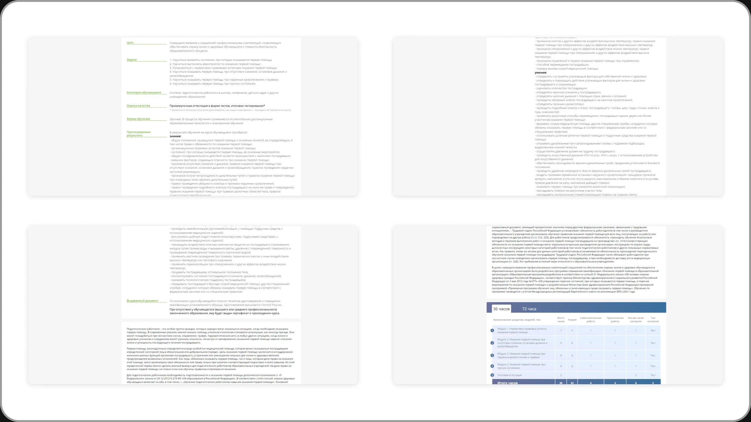
Not a single beautiful landing page, but a builder that assembles a page for any course.
AS IS
The old course page was a long landing page: blocks were repeated (the "Start learning now" call to action appeared twice), the benefits took up several screens, and the essentials – dates, certificate, price – got lost. The page for each program area was essentially assembled by hand.
Solution: the master page
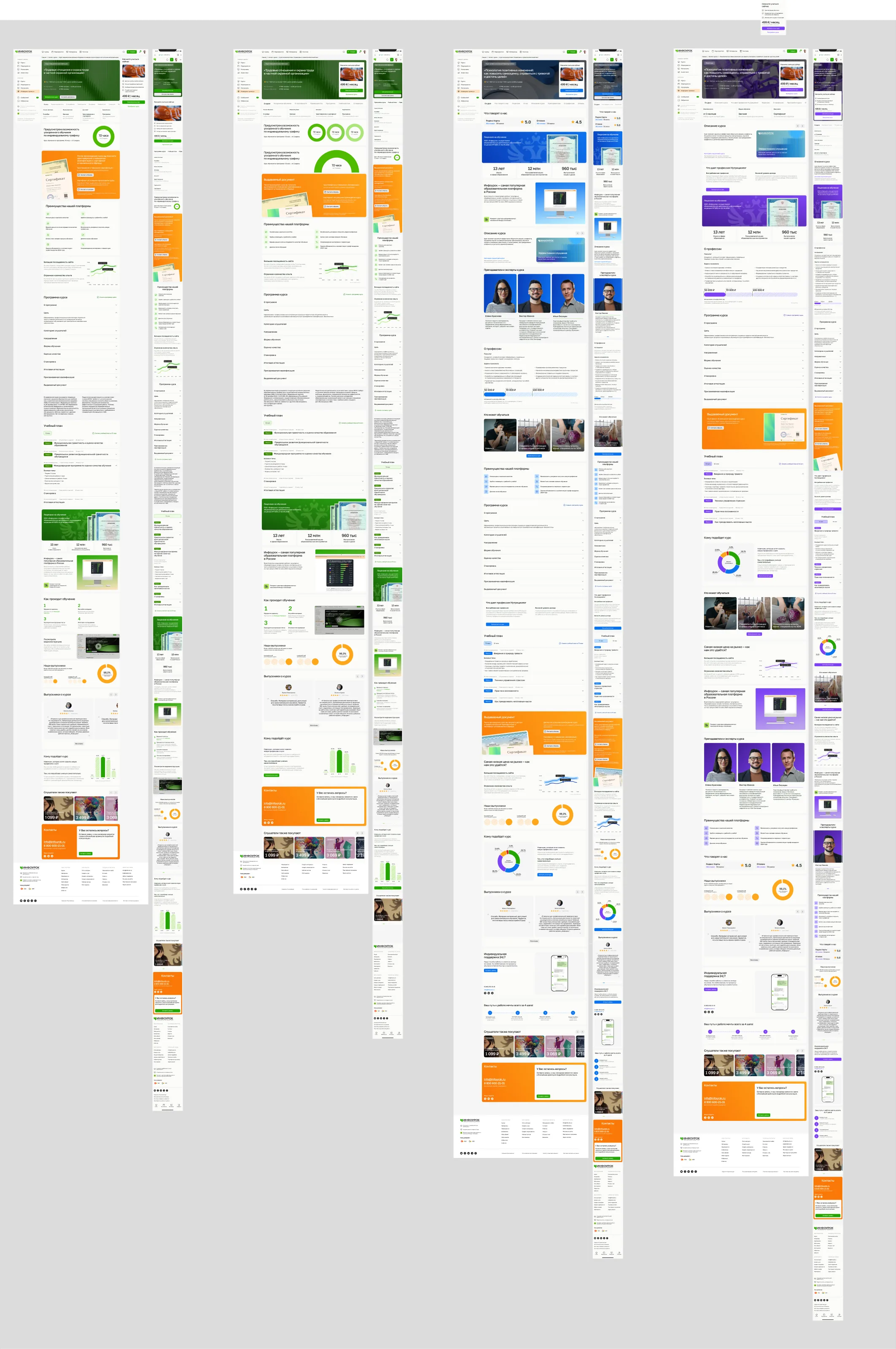
I built a master page – a library of ~28 modular blocks with a single grid and set of rules. Each block answers one user question.
| Block group | What it includes | Question it answers |
|---|---|---|
| Key information | Hero: course type, title, rating, number of learners; quick facts – start date, format, certificate, duration, price and installments | What is it, and is it right for me? |
| Content | Description, curriculum, study plan, about the profession, who it's for, who can enroll | What will I learn? |
| Trust | Reviews from external platforms, license, Skolkovo, instructors, graduate stories | Why can I trust this platform? |
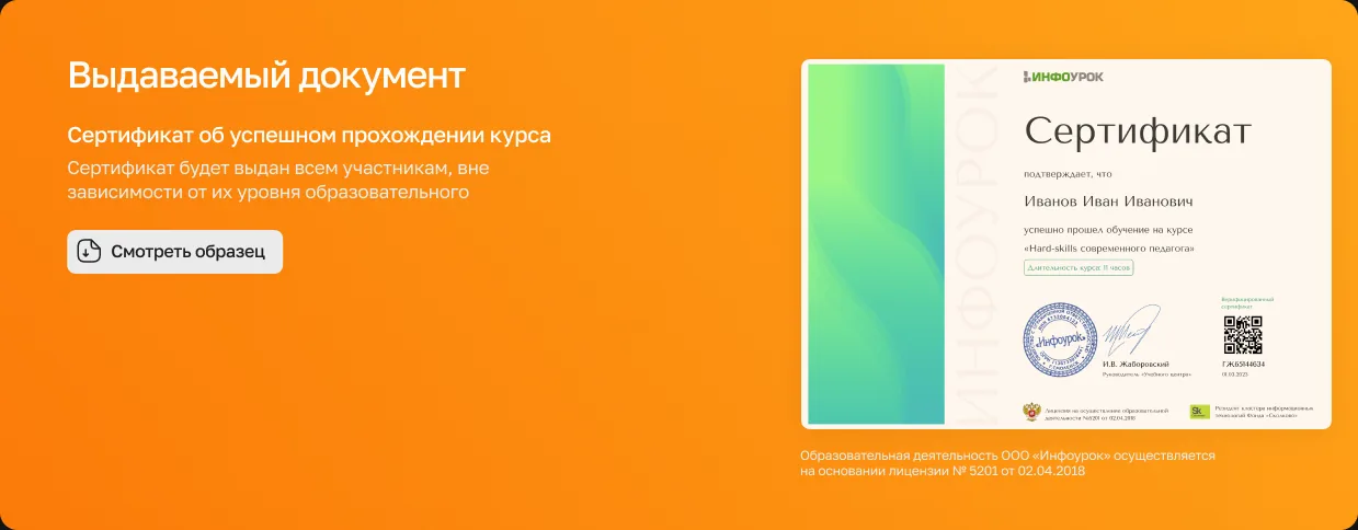
| Outcome | The certificate issued, with a sample, and graduate statistics | What will I get at the end? |
| Purchase and support | Price and why it's low, discounted application, Premium subscription, how learning works, 24/7 support, similar courses | How do I start, and what if I have questions? |
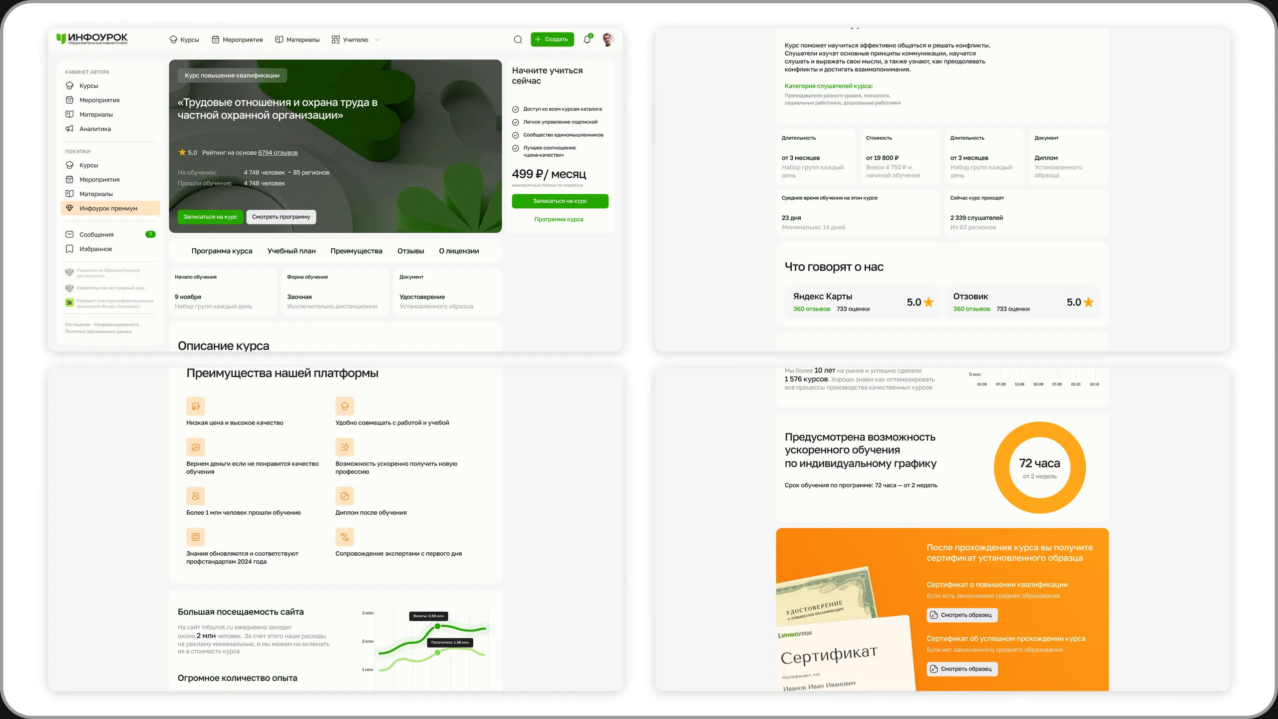
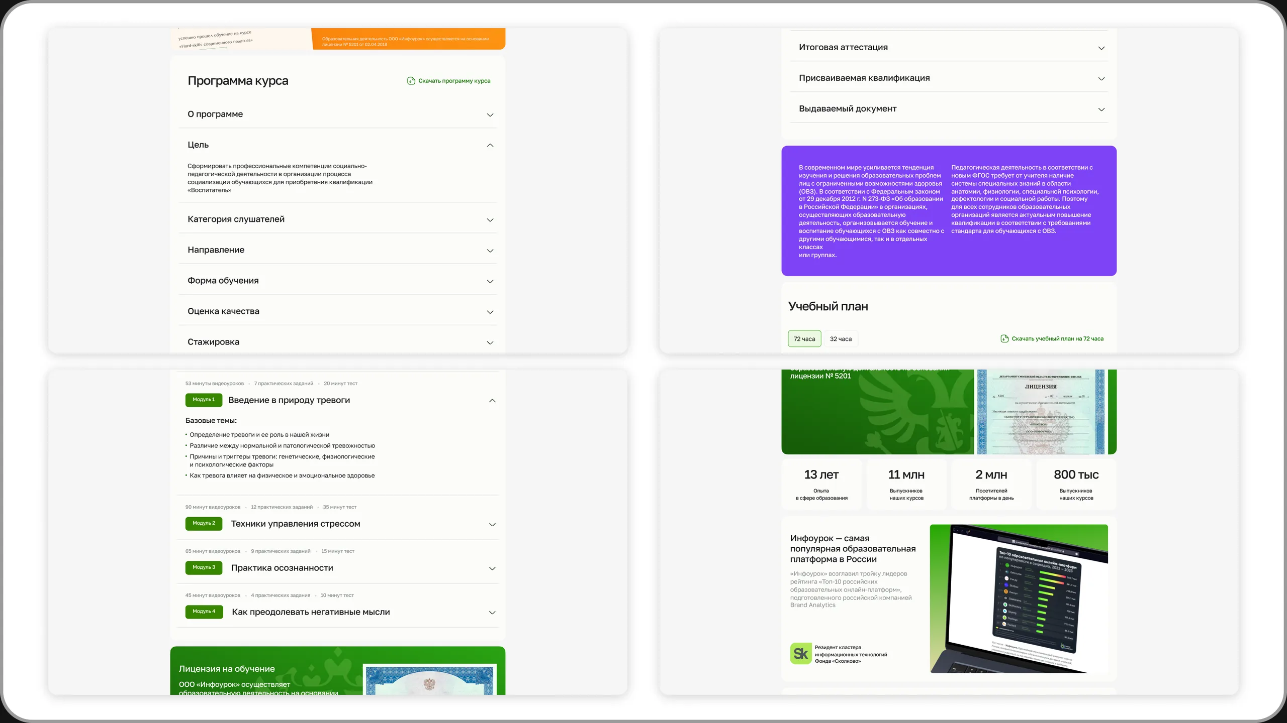
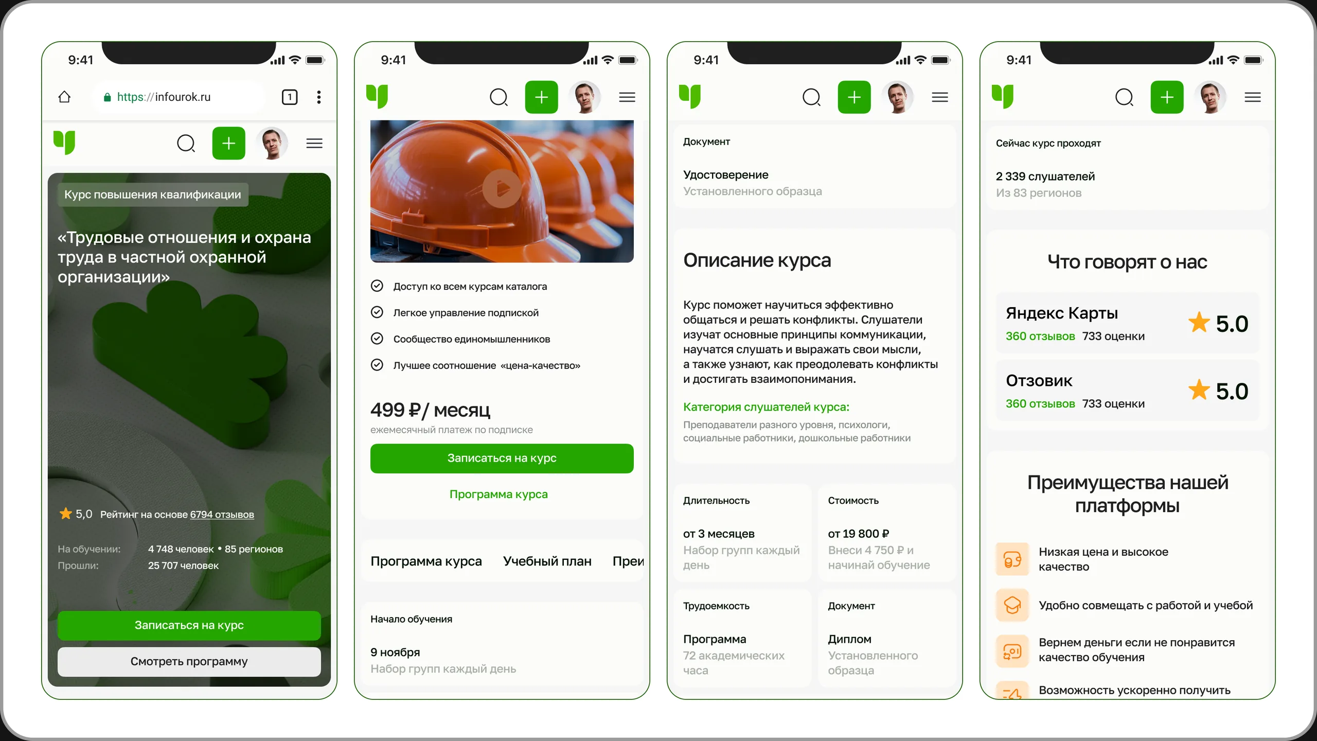
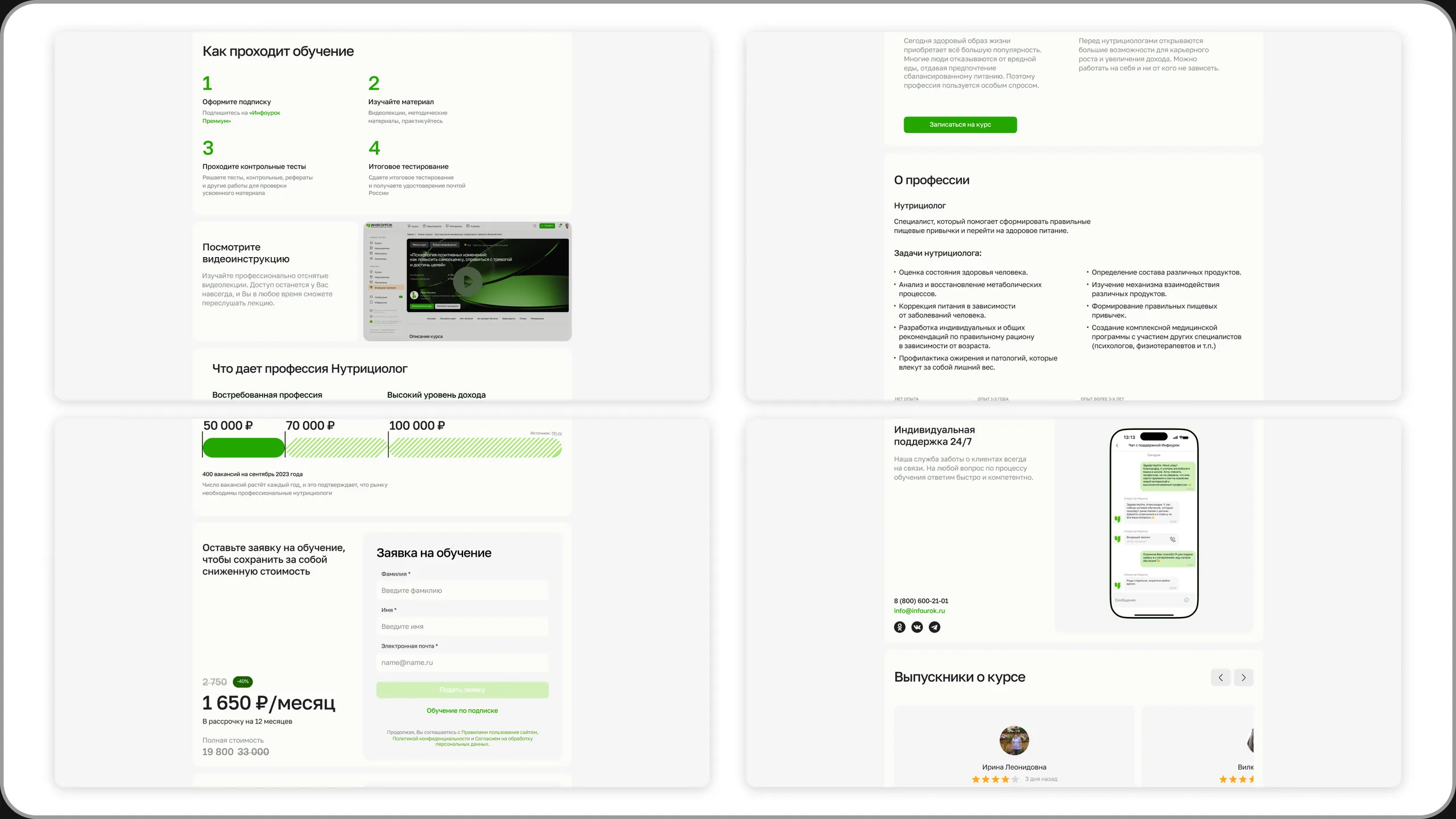
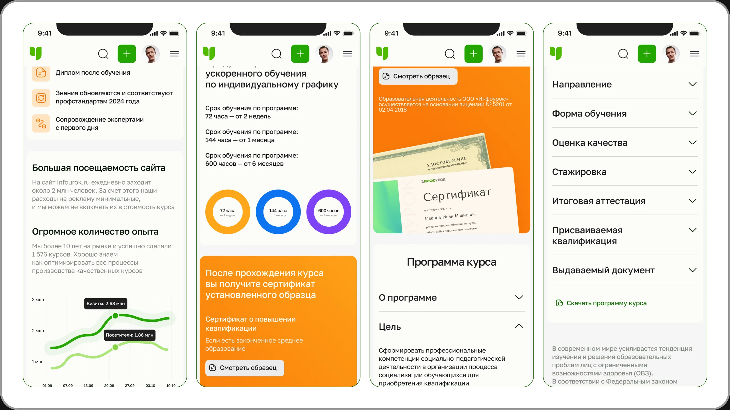
One system – different goals and color schemes
The master page is used to assemble pages for different product types. What changes is the set and order of blocks, the accent color and the certificate block – depending on what matters most for the purchase decision.
| Type | User's goal | Accent | What comes first |
|---|---|---|---|
| Professional development | Quickly get a certificate needed for work | ● green + ● orange | Start date, accelerated format, certificate, curriculum |
| Professional retraining | Change careers – takes longer to decide, higher price | ● blue | Trust: reviews, license, platform rating, instructors, about the profession |
| Mini-course | Try out a field with a small investment | ● purple | Description, career benefits, curriculum; a certificate instead of a diploma |
The "Certificate issued" block is an example of a component that adapts to the program type: a retraining diploma, a professional development certificate, or a mini-course certificate.


#4. Course application in the user account
From scattered forms to one clear scenario.
AS IS
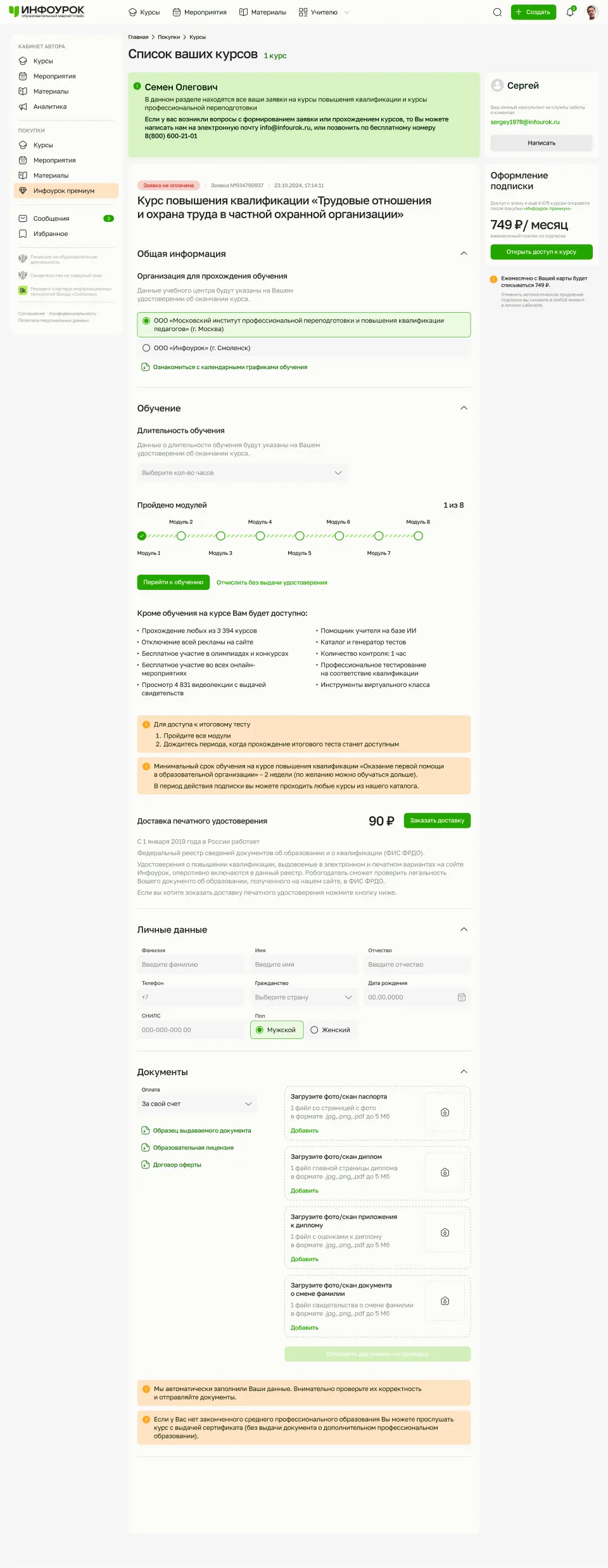
In the version we started from, the application was split across several states and screens: "access closed", card payment right in the course list, personal details, documents and delivery address – all in different places. Users couldn't tell what had already been done and what was still needed to receive their certificate.
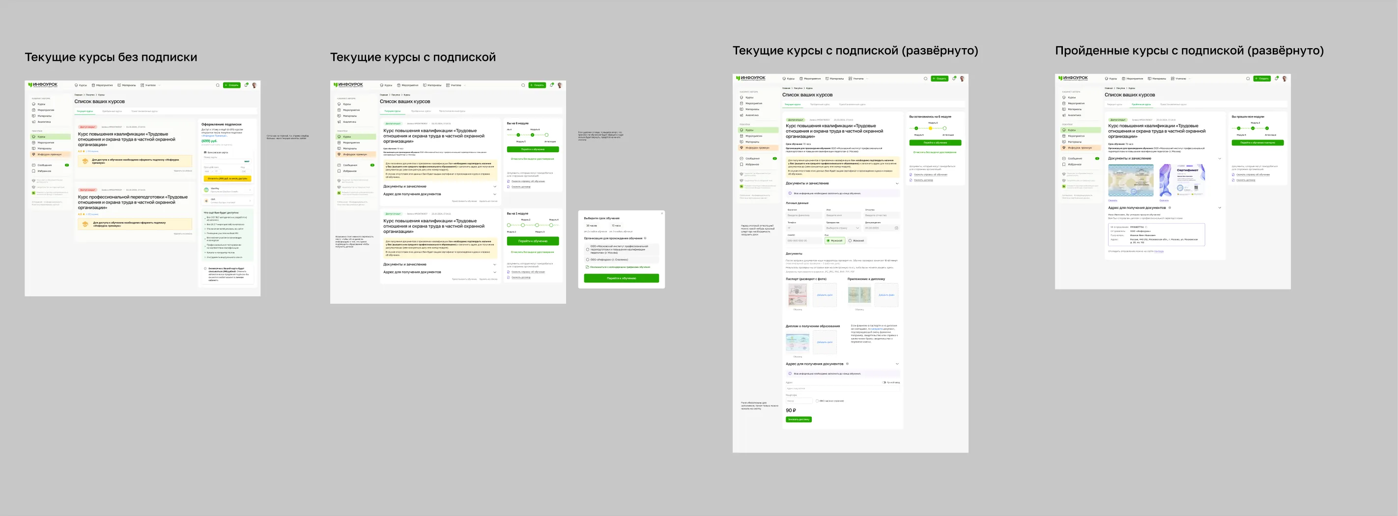
TO BE
The application became a single page with sequential steps. On the right are the application status and a personal advisor users can contact at any time.
- General information – training center and course schedule
- Learning – duration, module progress, link to lessons
- Certificate delivery – ordering and address
- Personal details – auto-filled from the profile, just need checking
- Documents – upload passport, diploma and other scans, submit for review
- Payment – self-funded or via the Premium subscription
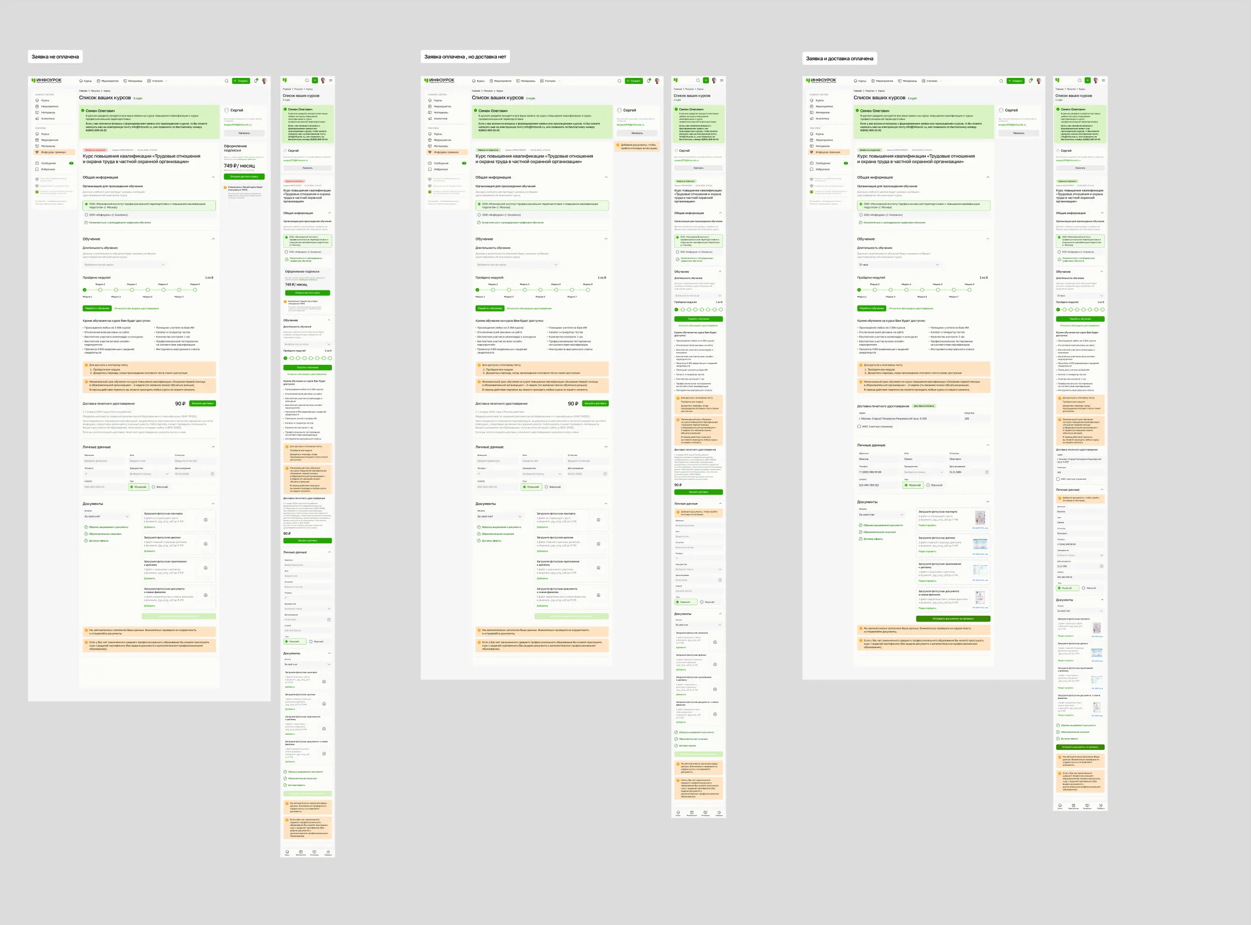
Three application states
| State | What the user sees | Next step |
|---|---|---|
| Application not paid | Choice of hours, details form, payment block | Pay or subscribe |
| Application paid, delivery not paid | Learning progress, an offer to order a printed certificate | Study and order delivery |
| Application and delivery paid | Progress, delivery address, completed details and documents | Complete the modules and the final assessment |
Design System
There was no unified design system at the start. Once the brand language was approved, we built the UI foundation from scratch.
Brand → tokens → UI Kit → components → patterns → product
What it included
- Tokens, colors, typography
- Components and their states
- Patterns and documentation
My role
- Planning the UI Kit structure
- Building the foundation: tokens and base components
- Delegating tasks to two middle designers, reviewing their work and keeping it consistent
Validation
Key scenarios went through a cycle: problem → hypotheses → options → prototype → testing → final UI.
What we managed to do: hallway testing, internal UX reviews, expert interviews and surveys with Infourok's team of content specialists.
Stakeholders and development
Stakeholder management
Infourok had a strong product team but no in-house design ownership, and on a number of issues the final say rested with a leader who had his own vision. Sometimes the team supported a decision and the leader didn't.
- Argued for decisions through the user's task and the business goal
- Presented several options rather than defending a single design
- Proposed testing instead of debating taste
- Once a business decision was made, adapted the design without losing the core UX logic
Development and handoff
The client had in-house developers and contractors. I worked directly with the frontend and backend leads, discussing feasibility, constraints and the documentation format – component states, responsive rules, annotations, edge cases.
Process: design → design review → development discussion → handoff → design grooming → implementation
After I left, the team continued to receive design support from aic during implementation.
Outcome
By the end of my involvement, the foundation of Infourok's new product model and visual system was in place.
| Brand | A new visual language and an updated brand book |
| Product | A new platform architecture and interface |
| Onboarding | Registration with personalization |
| Catalog | A unified framework for course, event and material catalogs |
| Course page | A master page built from modular blocks, with builds for professional development, retraining and mini-courses |
| Application | The course application as a step-by-step scenario with three states |
| Marketplace | Patterns for the catalog, product page and seller experience |
| System | UI Kit, tokens and components – a foundation for future digital products |
What I would do differently
Research earlier
I would bring research in at an earlier stage – not only to understand users, but also as an argument in contested decisions.
Stakeholder alignment
I would agree on the criteria upfront: what the product team decides, where executive approval is needed, and what gets confirmed by testing.
Test before debate
When the team and a stakeholder see a solution differently, it's better to agree in advance on how to test it than to argue about taste.
Gallery
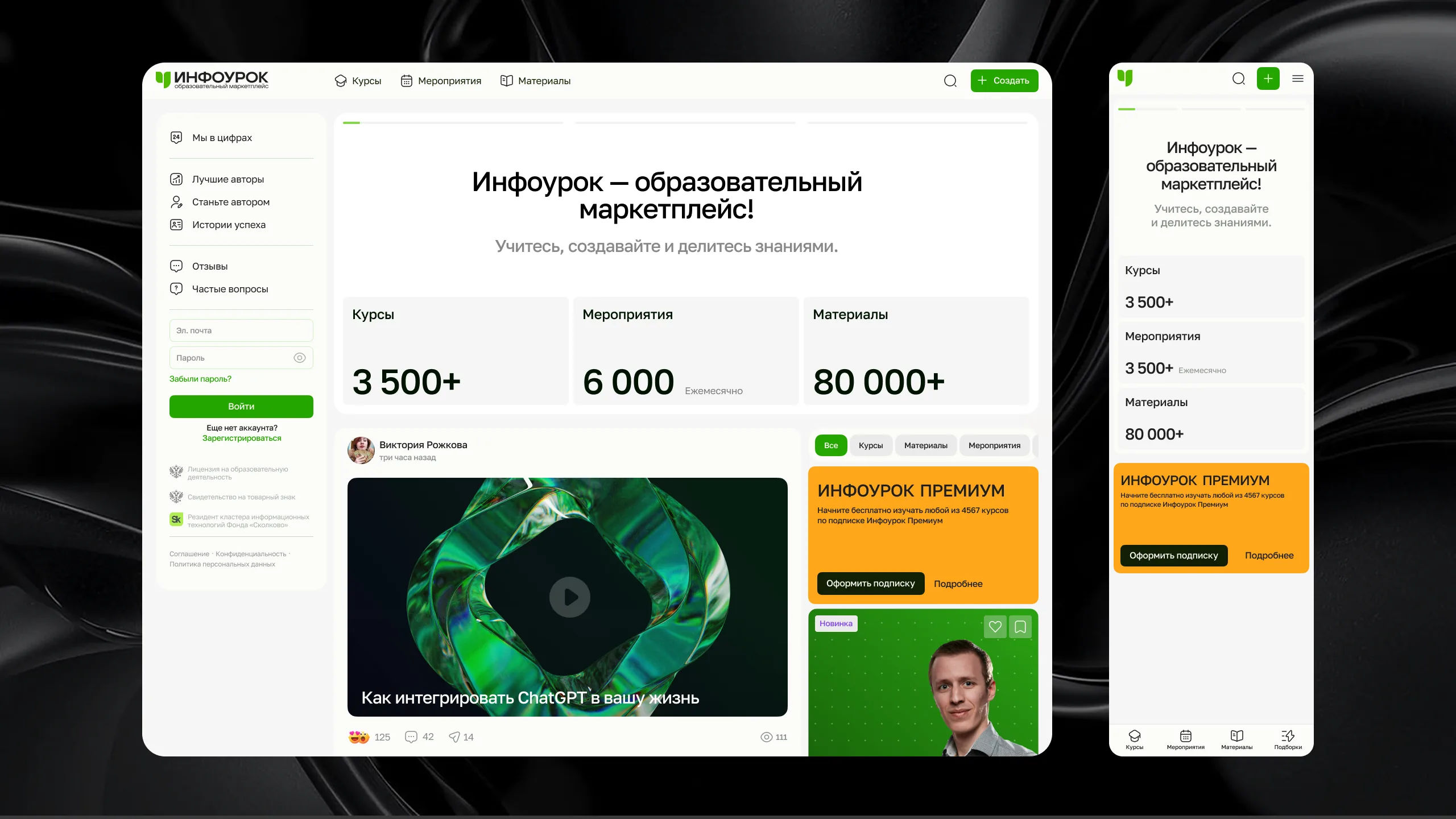
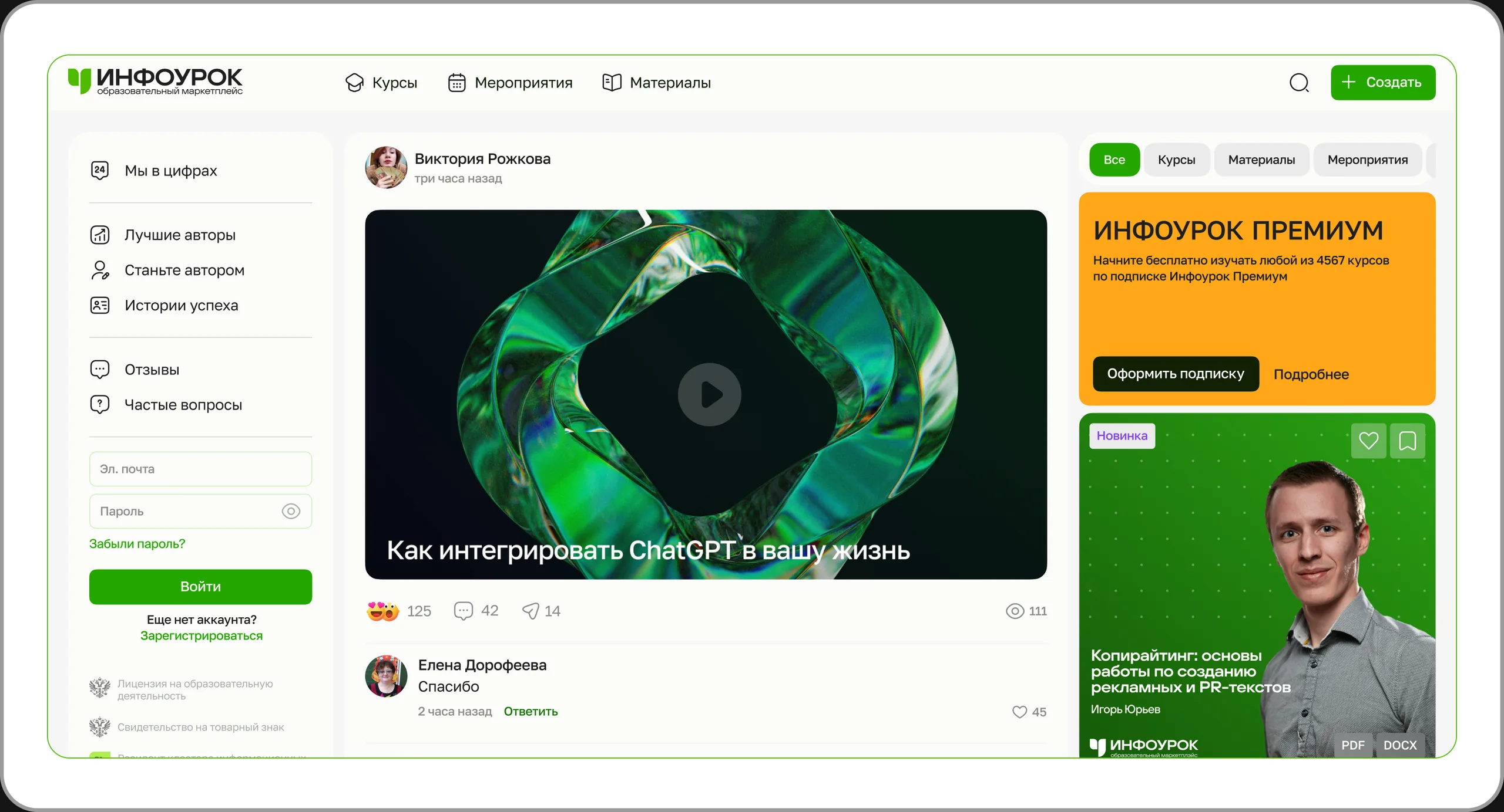
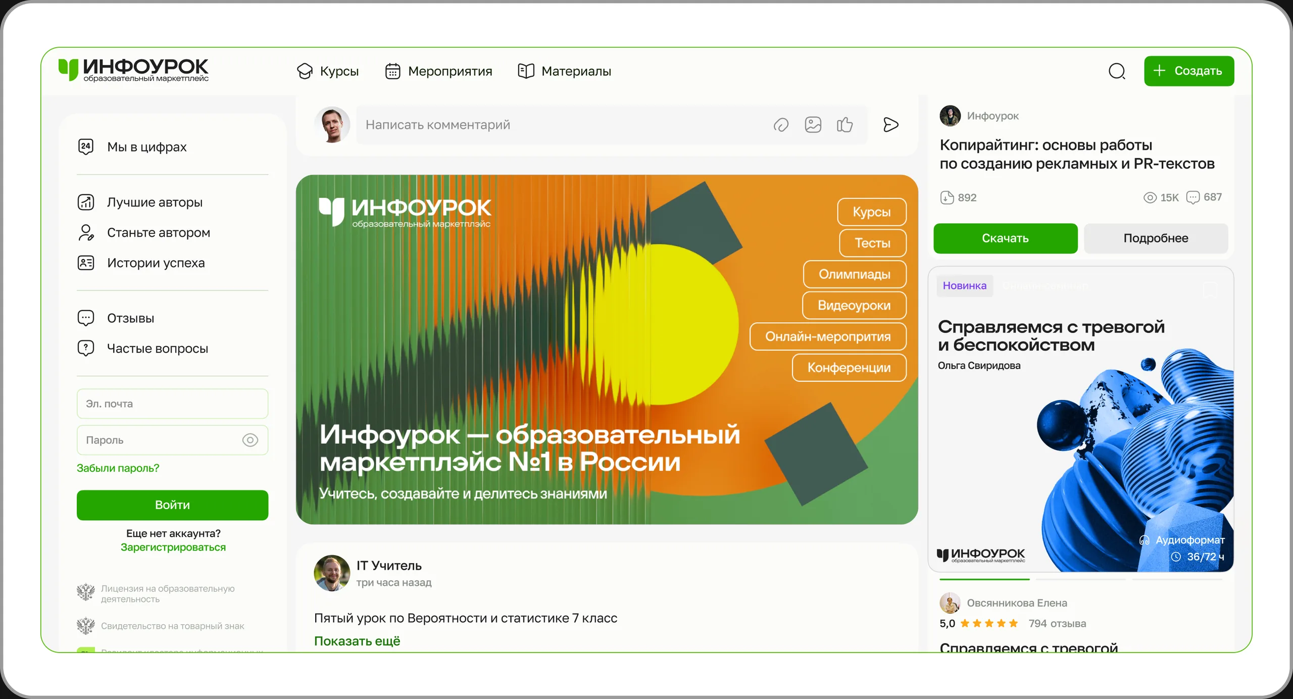
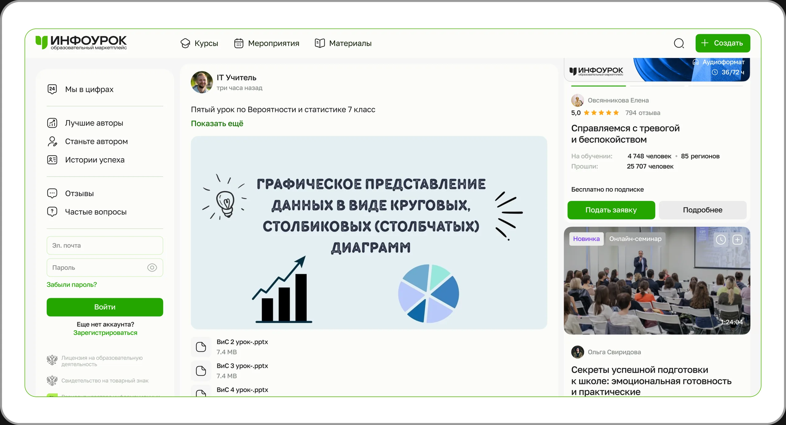
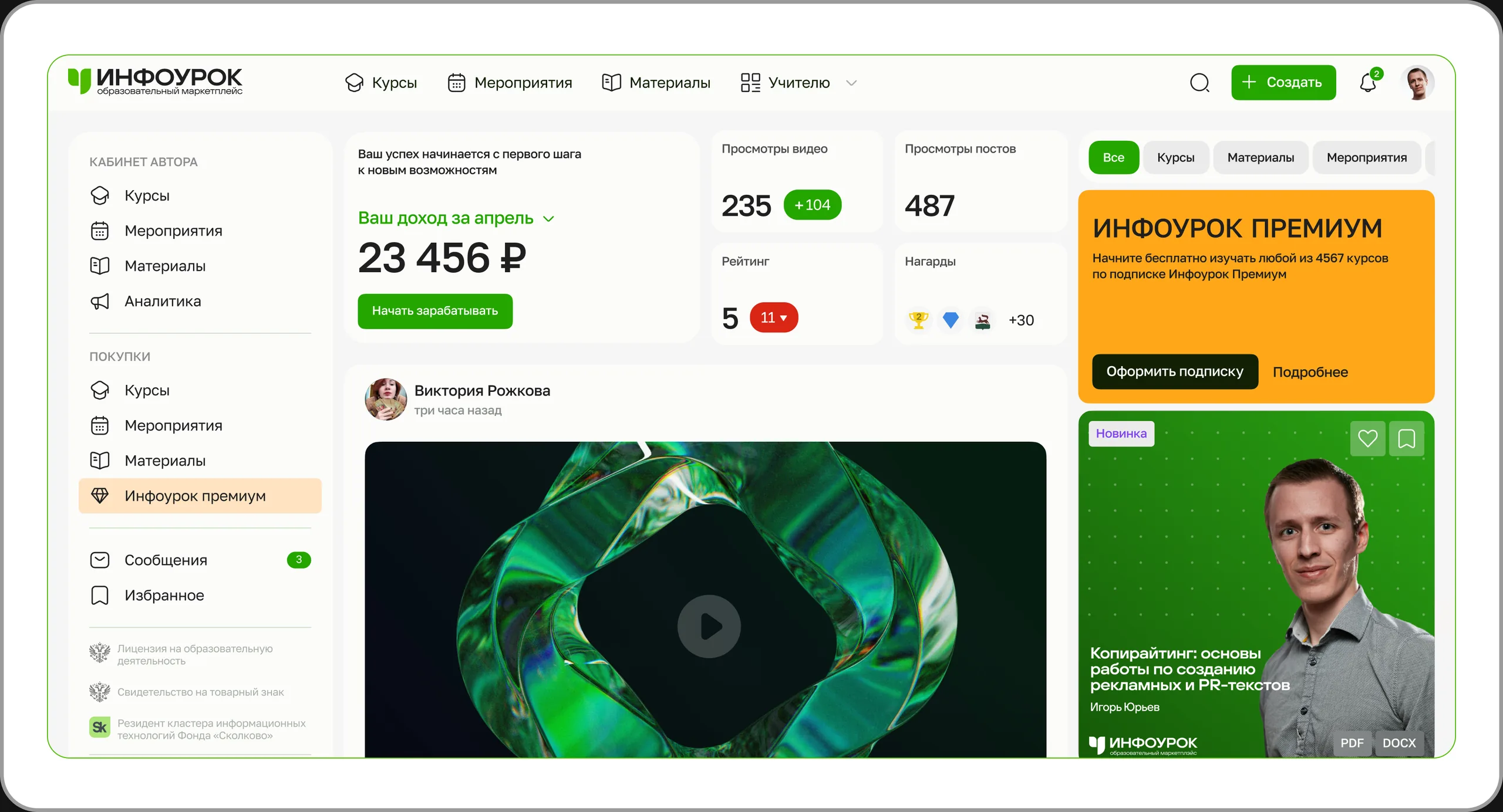
Product homepage. Web
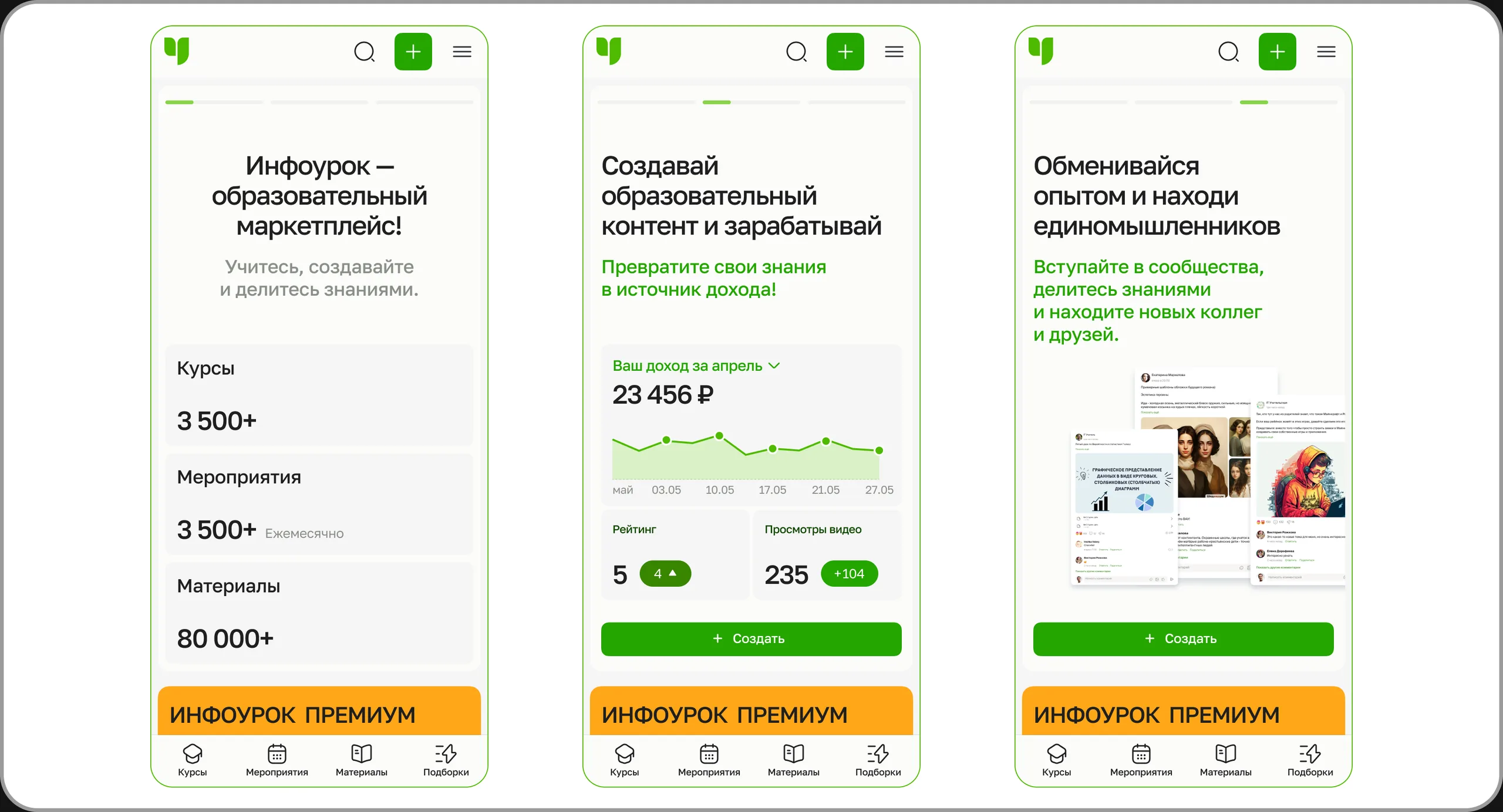
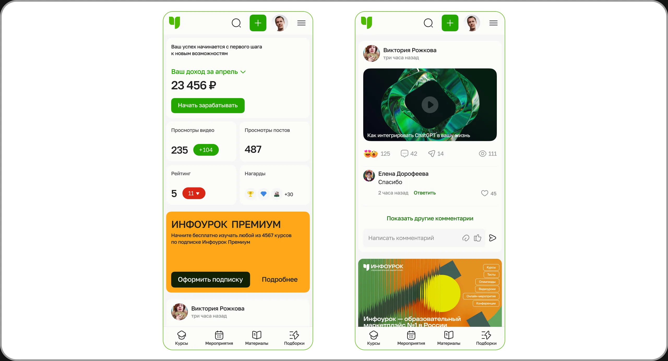
Product homepage. Mobile web
Creator account page. Web
Creator account page. Mobile web
Course catalog. Web
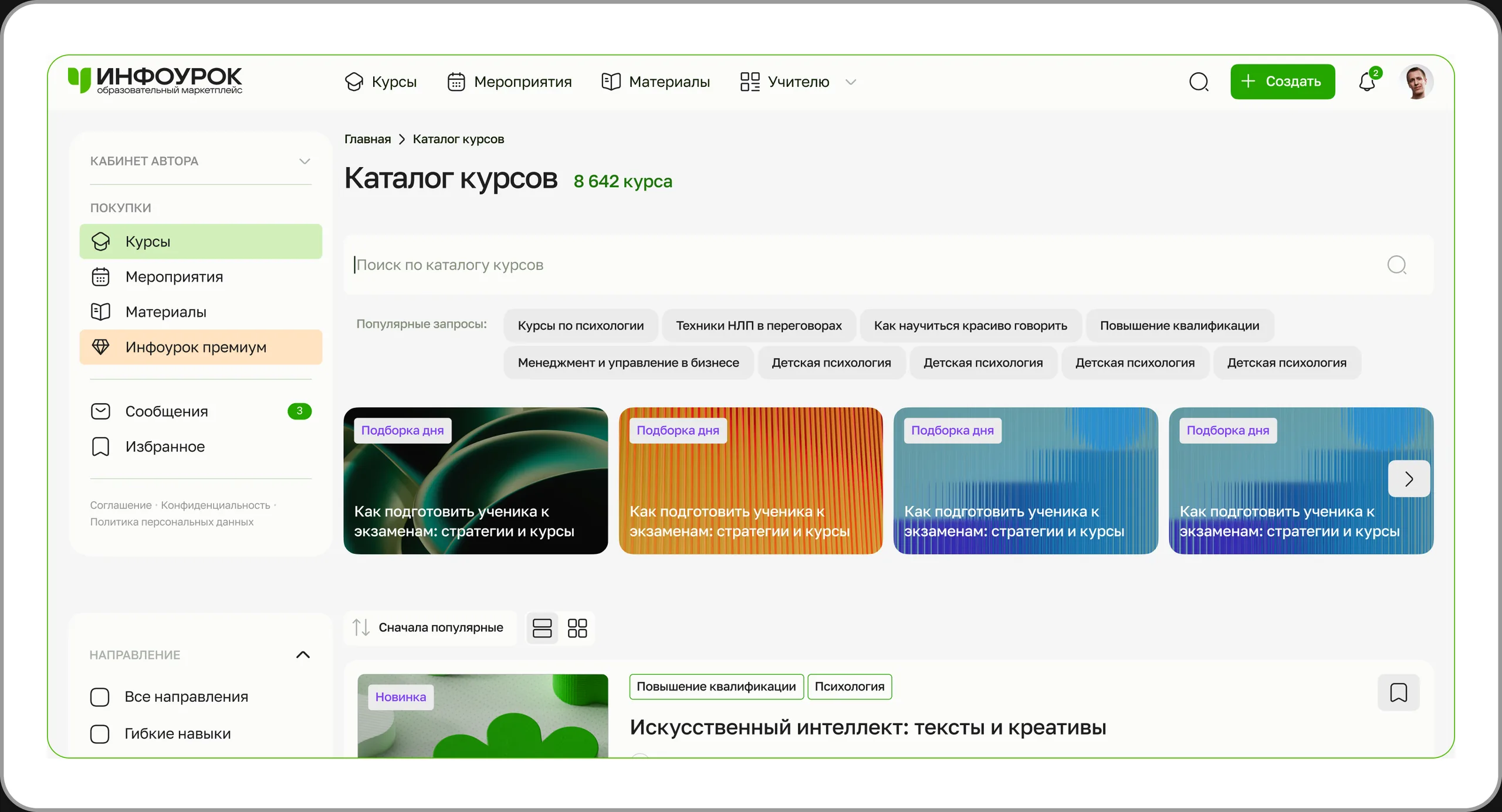
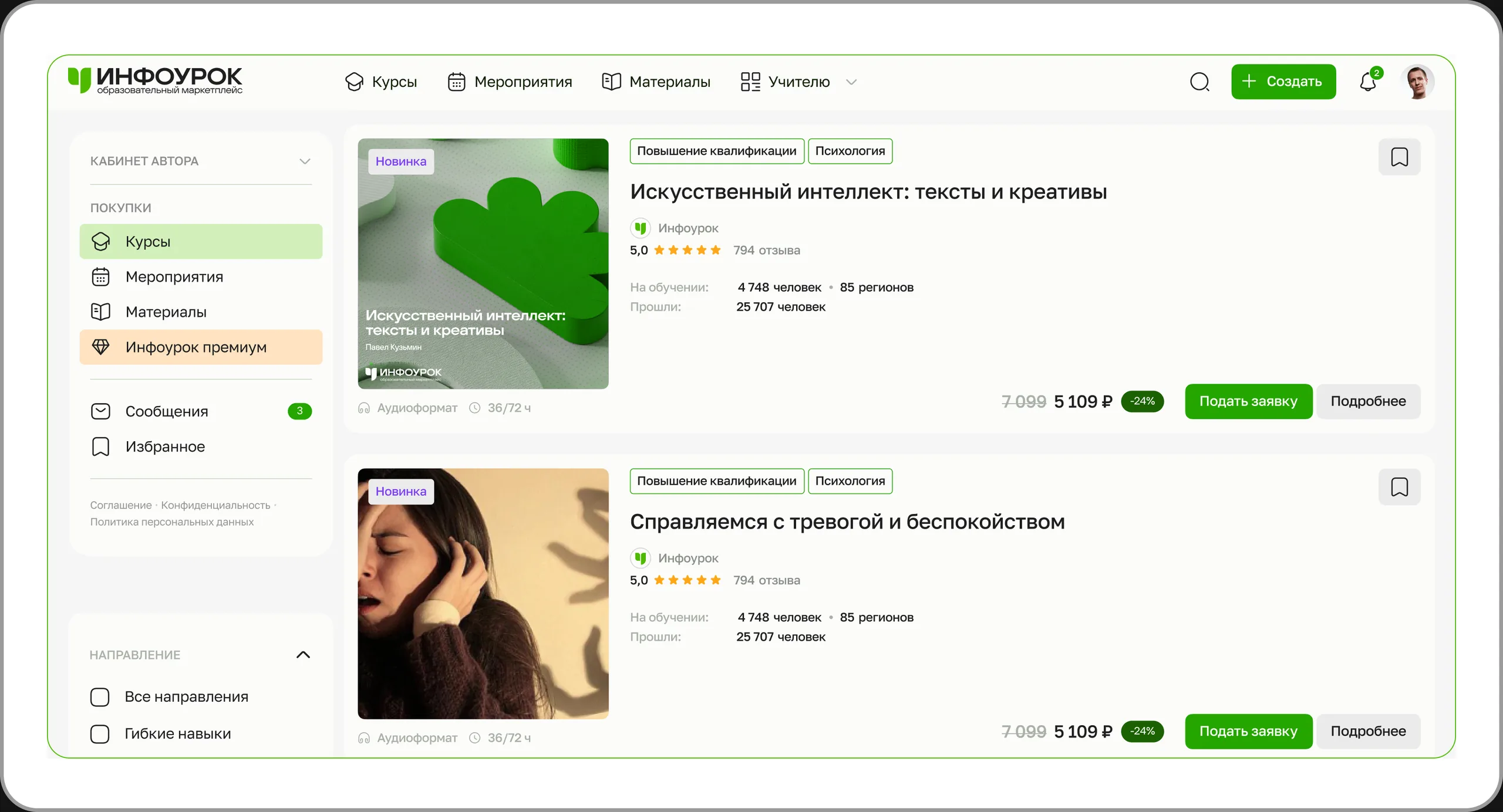
Course catalog. Mobile web
Materials catalog. Web
Materials catalog. Mobile web
Events catalog. Web
Events catalog. Mobile web